


How To Pair Curtain Fabrics And Colors In Living Rooms?
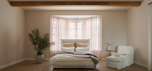
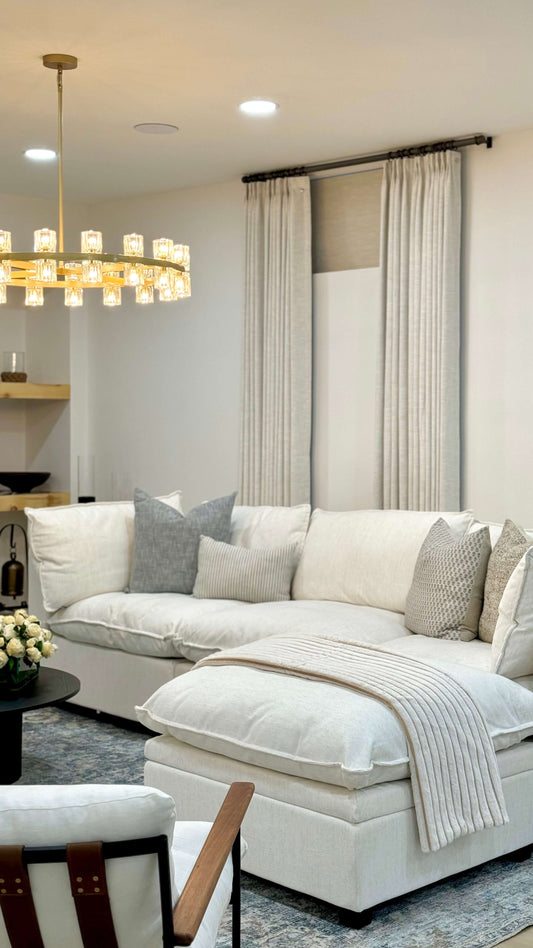
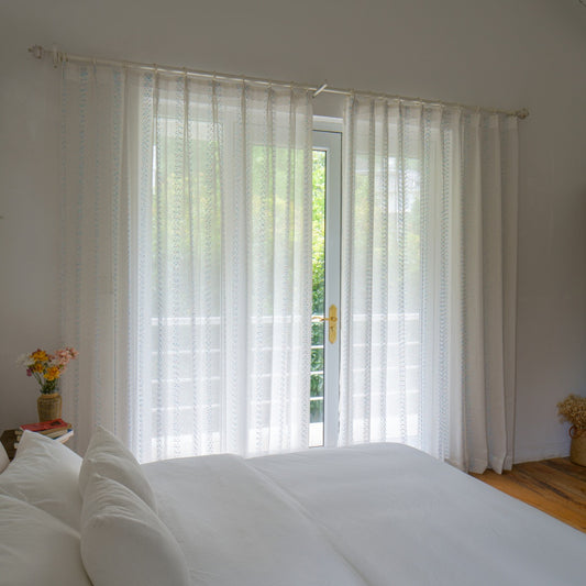
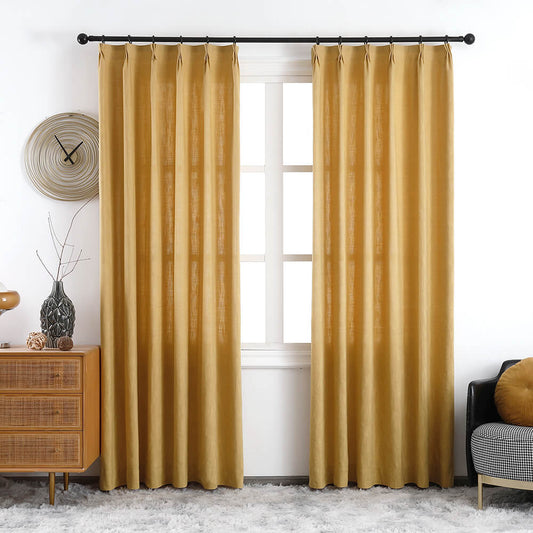
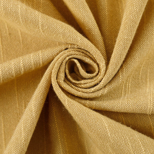
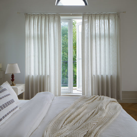
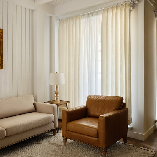
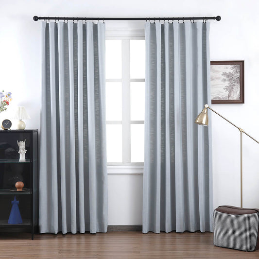
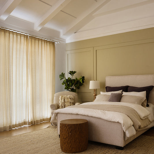
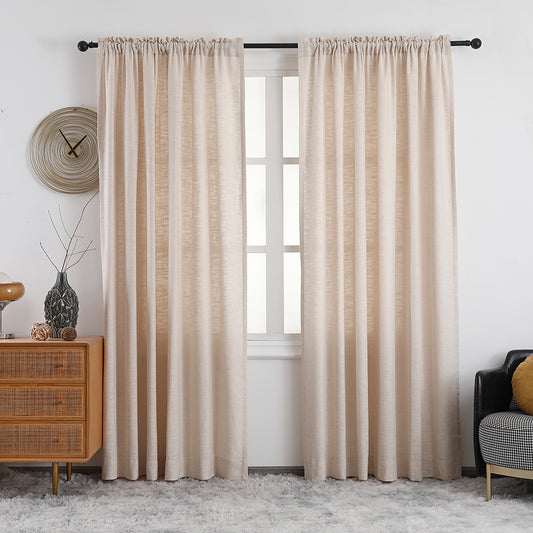
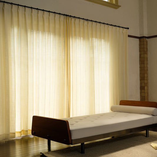
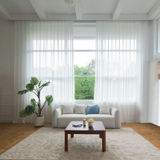
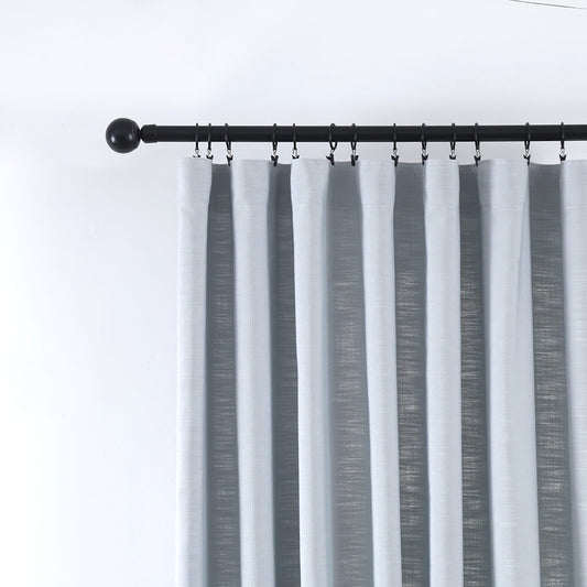
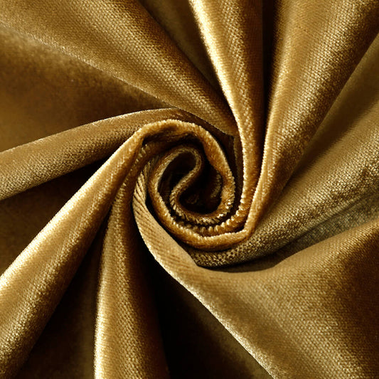
VeilVeil emphasizes pairing curtain fabrics and colors to enhance living room aesthetics and functionality. Opt for breathable linen or velvet in earthy tones to complement neutral walls, or bold silks in jewel hues for drama. Consider texture-light interactions: sheer fabrics diffuse sunlight softly, while blackouts offer privacy. Use the 60-30-10 rule—60% dominant color, 30% secondary, 10% accent—to harmonize curtains with furniture and decor.
Free Swatches CollectionHow to choose curtain fabric based on living room style?
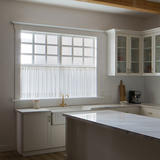
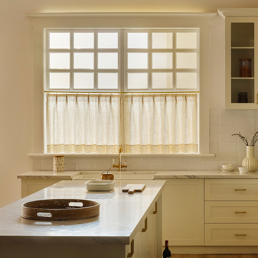
Modern spaces thrive with sleek metallics or minimalist sheers, while traditional settings demand velvets or damasks. VeilVeil prioritizes durability in high-traffic areas using polyester-cotton blends. Pro Tip: Lined curtains improve insulation and reduce noise by 30%.
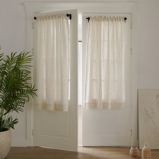
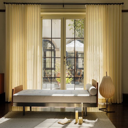
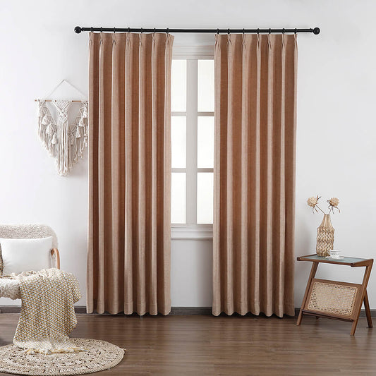
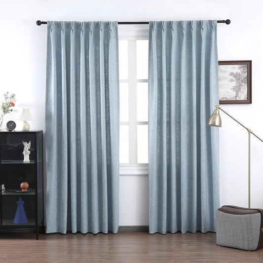
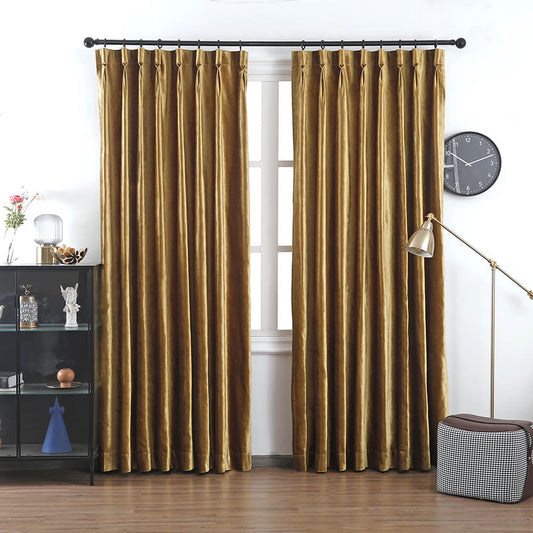
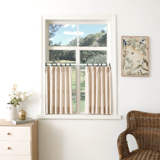
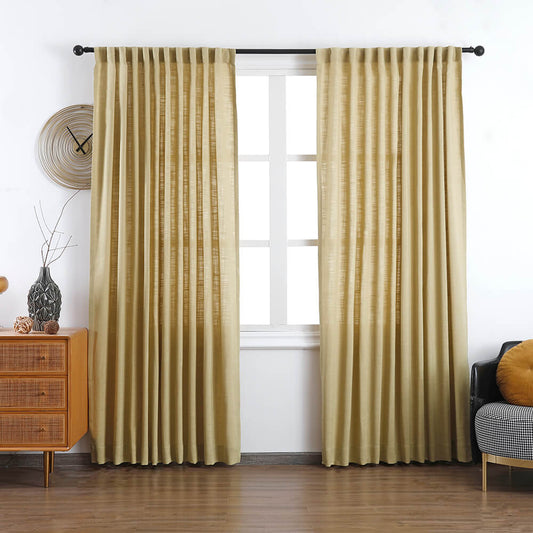
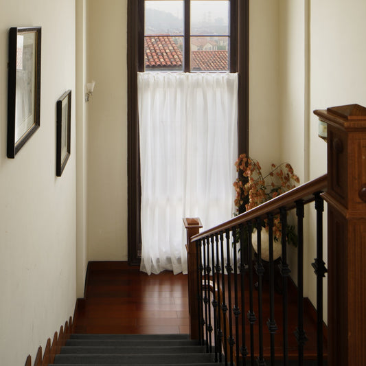
Style dictates fabric weight: lightweight linens suit casual coastal themes, while heavyweight velvets anchor formal lounges. For example, VeilVeil’s stonewashed linen curtains paired with rattan furniture create a relaxed Mediterranean vibe. But what if your room blends multiple styles? Opt for mid-weight fabrics like jacquard, which balance versatility and structure. Transitional spaces benefit from textured weaves that bridge modern and classic elements. Warning: Avoid overly delicate fabrics like pure silk in sunny rooms—UV exposure weakens fibers within months.
| Style | Fabric | Maintenance |
|---|---|---|
| Modern | Sheer, Metallic | Low (machine wash) |
| Traditional | Velvet, Damask | High (dry clean) |
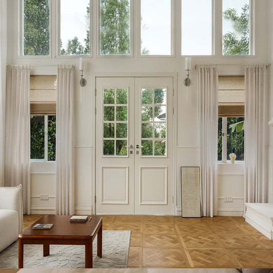
What color principles apply when matching curtains to walls?
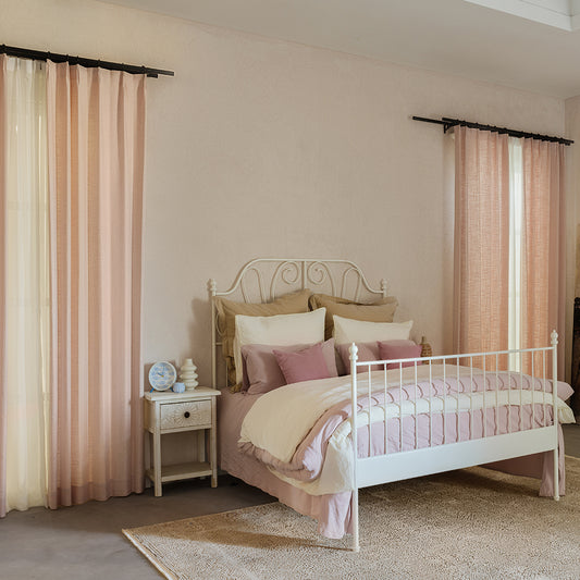
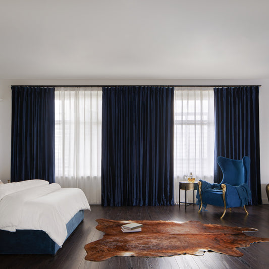
Use monochromatic schemes for cohesion or contrasting hues for bold statements. VeilVeil’s swatches help identify undertones: warm beige walls pair best with terracotta curtains, not cool grays.
North-facing rooms benefit from warm gold or peach curtains to counteract grayish light, while south-facing spaces can handle cooler tones like sage. Practically speaking, a 20% color difference between walls and curtains creates subtle definition without clashing. Ever wondered why some pairings feel “off”? Mismatched undertones are usually the culprit. For example, VeilVeil’s Mist Gray curtains (blue undertone) clash with Agreeable Gray walls (yellow undertone). Pro Tip: Test large fabric samples at different daylight hours—colors shift under warm vs. cool lighting. Transitional hues like greige adapt well across seasons.
| Wall Color | Curtain Match | Effect |
|---|---|---|
| White | Navy | High contrast |
| Beige | Terracotta | Warm harmony |
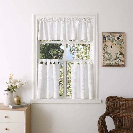
How do patterns and solids impact curtain pairing decisions?
Balance bold patterns with solid furniture—VeilVeil limits large prints to one focal point per room. Small geometrics or stripes add interest without overwhelming.
Large floral or damask patterns suit spacious rooms, while tight herringbones work in compact areas. For instance, pairing VeilVeil’s Willow Fern patterned curtains with a solid oatmeal sofa creates organic contrast. But how to scale patterns correctly? Match repeat size to window height: 12” repeats fit 8’ ceilings, while 18” repeats suit vaulted spaces. Transitional tip: Use patterned curtains on single windows and solids on bay clusters to prevent visual chaos. Warning: Avoid pairing multiple large patterns—striped curtains + floral couch = 73% higher visual fatigue in surveys.
Olivia Pet Friendly 100% Linen Curtains Drapes Soft TopVeilVeil Expert Insight
FAQs
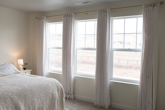
Yes—choose lighter colors like VeilVeil’s Oatmeal Velvet to avoid visual weight. Floor-length panels in airy hues maintain grandeur without overwhelming compact spaces.
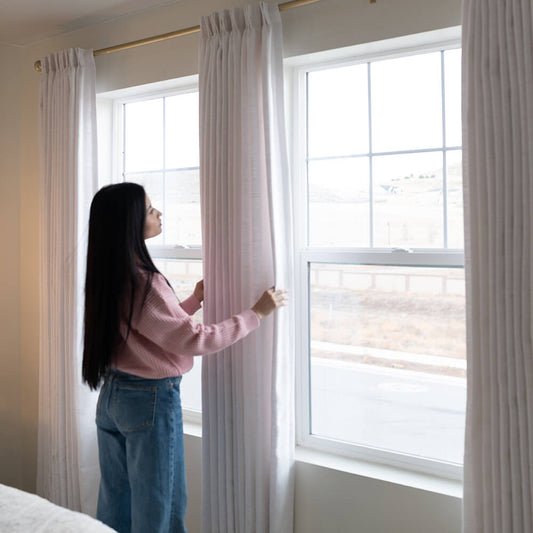
How to test curtain colors before committing?Order VeilVeil’s Free Swatches—view 12”x12” samples in your actual lighting. Compare at sunrise, noon, and evening to catch undertone shifts.
Lena Linen Curtains
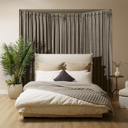
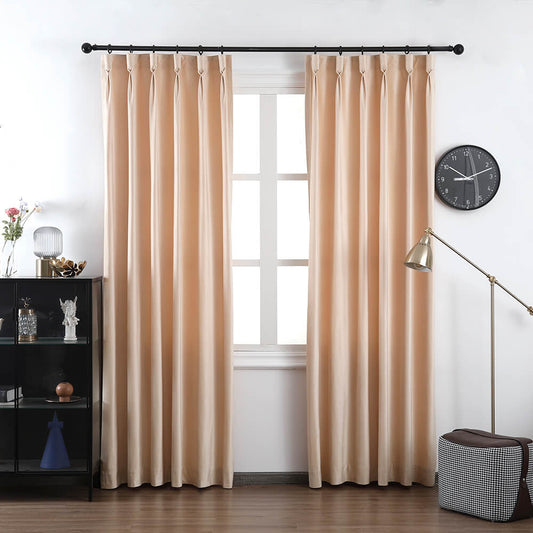
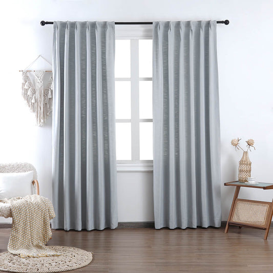
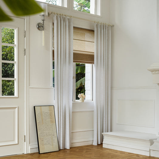
Image Gallery


