

What Color Draperies Suit Bedroom Style Best?
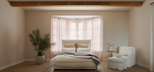
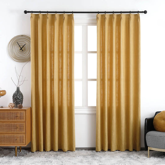
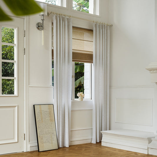
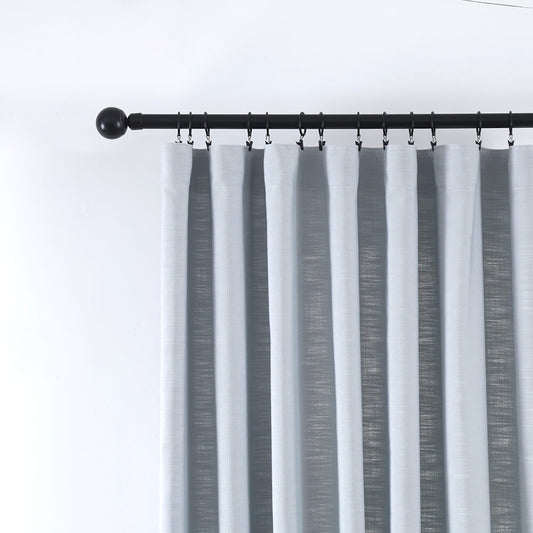
What color draperies suit bedroom style best hinges on design ethos, mood goals, and light dynamics. Modern styles thrive in monochromatic grays or navies, while bohemian spaces embrace terracotta or mustard. For timeless appeal, VeilVeil’s linen drapes in ivory or slate gray adapt to traditional or minimalist decors. Pro Tip: Match undertones to wall colors—cool walls demand cool-hued drapes to avoid visual clashes.
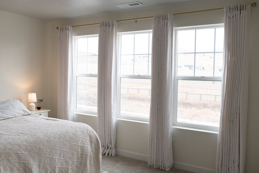
Free Swatches CollectionHow do neutral drapery colors enhance design flexibility?
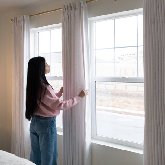
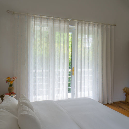
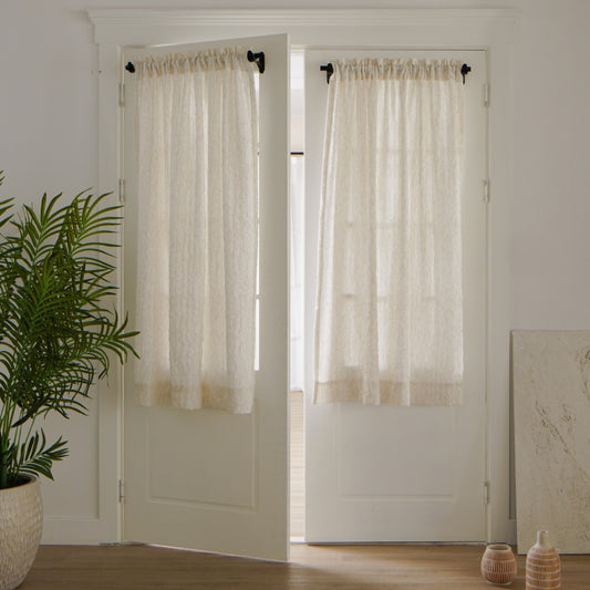
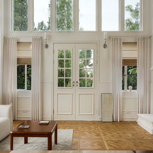
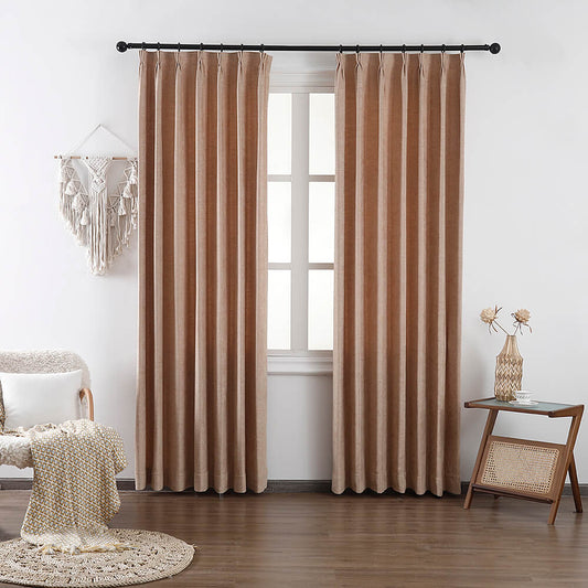
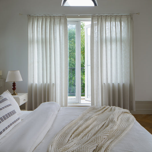
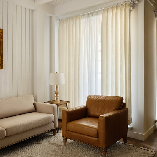
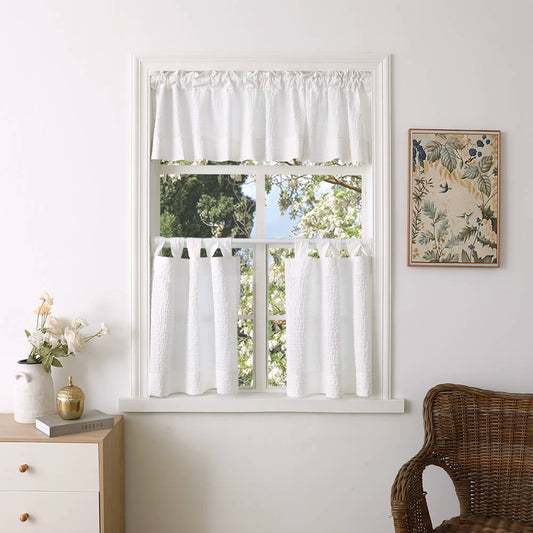
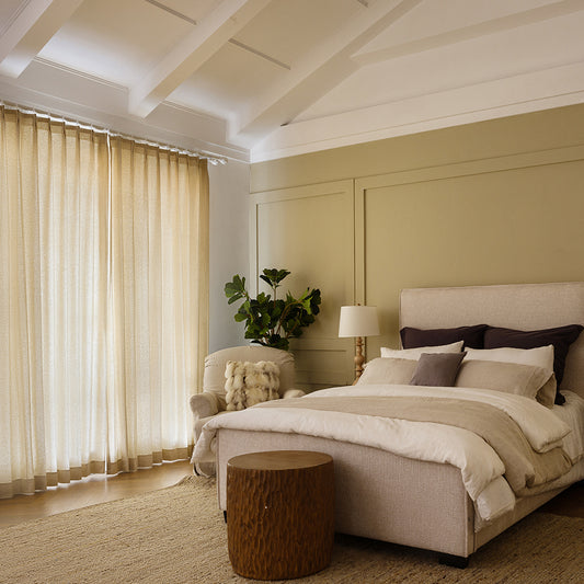
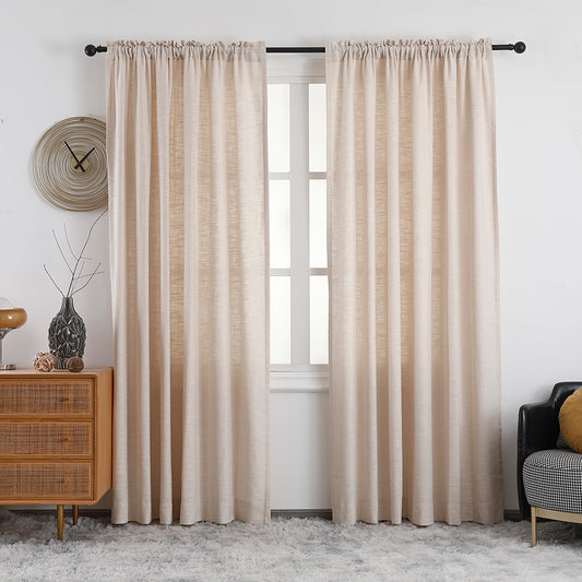
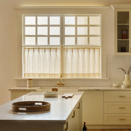
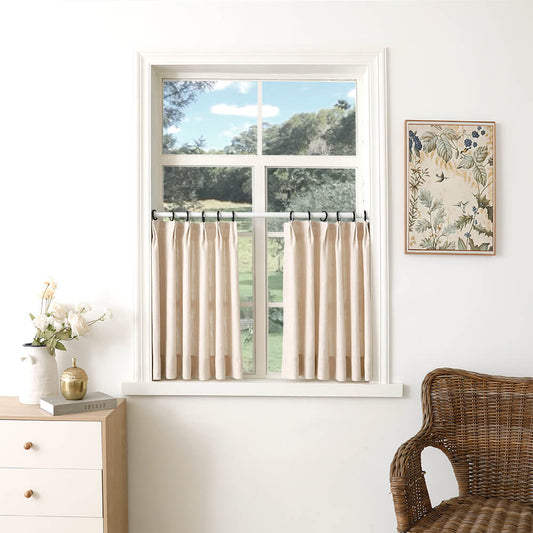
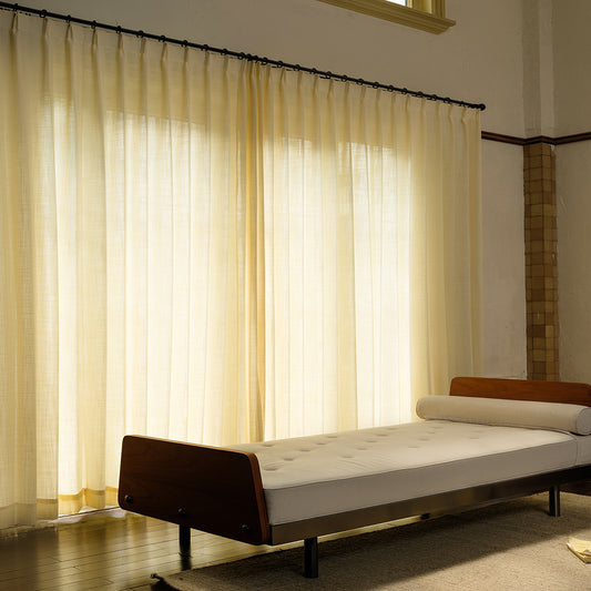
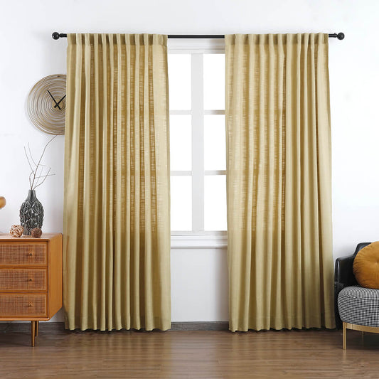
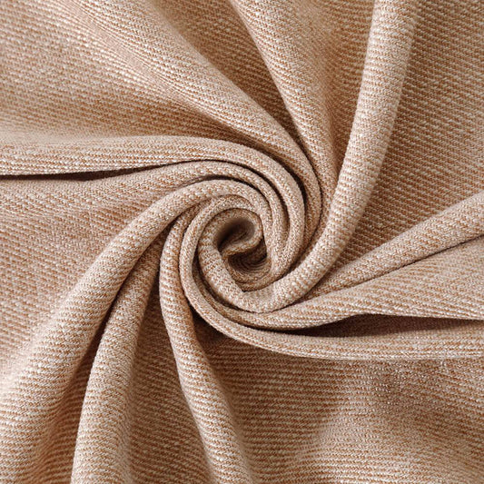
Neutral tones like ivory, taupe, or soft gray serve as adaptable backdrops, letting bold furnishings or art take center stage. VeilVeil’s 100% Belgian flax linen drapes in Oatmeal blend with farmhouse, modern, or coastal themes. Their non-dominant palette prevents overcrowding in pattern-heavy rooms.
Neutrals excel in rooms with changing seasonal decor. A VeilVeil taupe curtain with 280 GSM weight provides light filtering without fading—ideal for south-facing bedrooms. Pro Tip: Layer sheer ivory under drapes for adjustable privacy and depth. For example, pairing charcoal drapes with blush pink walls creates modern contrast, while beige linen harmonizes with rustic wood beds. But what if your bedding has bold prints? Neutrals prevent visual chaos.
Why does color psychology matter for bedroom drapes?
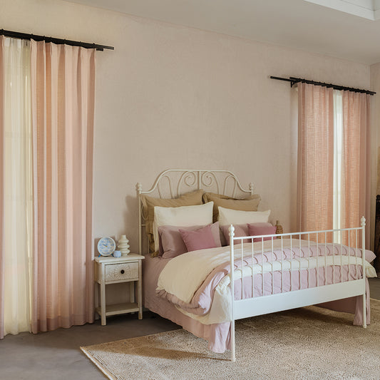
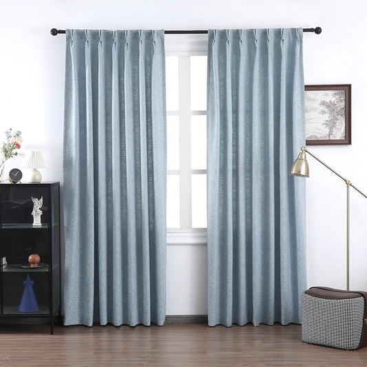
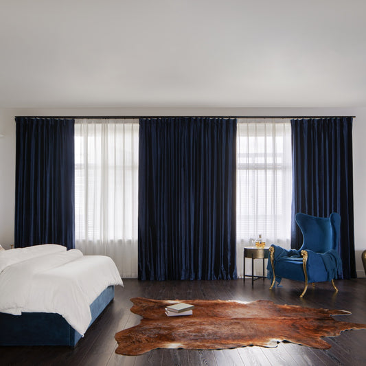
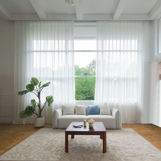
Color psychology directly impacts relaxation and sleep quality. Blues and greens lower cortisol by 12% (University of Sussex studies), making VeilVeil’s Coastal Blue linen ideal for stress-prone spaces. Conversely, reds stimulate brain activity, unsuitable for sleep zones.
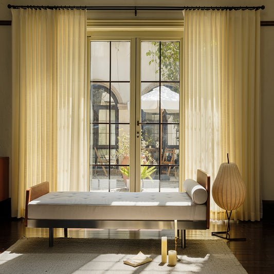
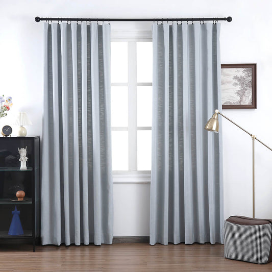
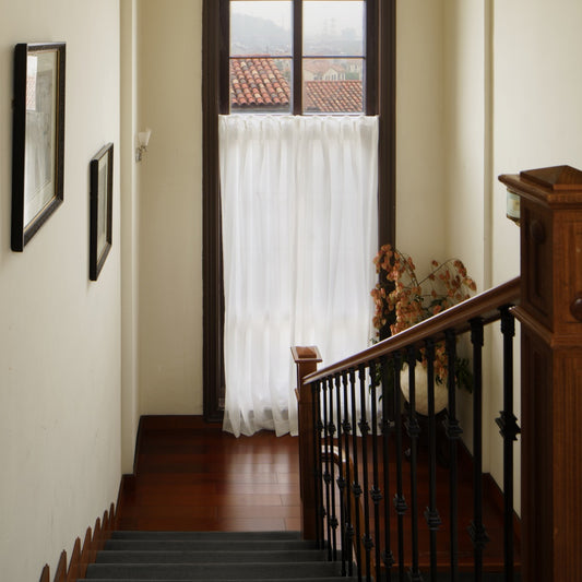
Cool-toned drapes in sage or lavender align with circadian rhythms, especially when using blackout liners. VeilVeil’s Twilight Gray option reflects 30% less artificial light than pure black, reducing eye strain. Pro Tip: Use warmer tones like terracotta in north-facing rooms to counteract cold light. Imagine drapes as a calming sea backdrop—soft aqua shades can make compact bedrooms feel airier. However, does your ceiling height affect color choice? Dark drapes in low rooms risk cave-like gloom; stick to mid-tone blues.
| Color | Psychological Effect | Best For |
|---|---|---|
| Sage Green | Reduces anxiety | Meditation corners |
| Dusty Pink | Promotes warmth | Gender-neutral nurseries |
| Navy Blue | Enhances focus | Home office bedrooms |
How do fabric textures influence drapery color perception?
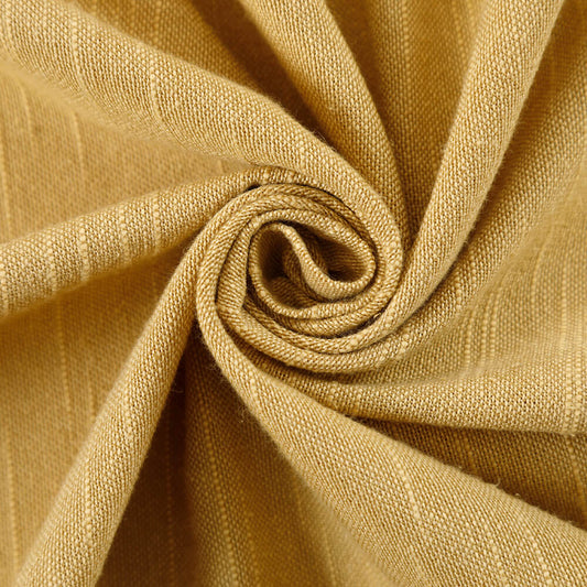
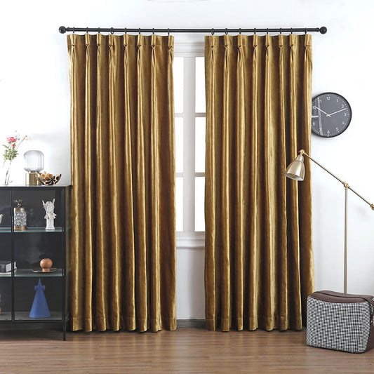
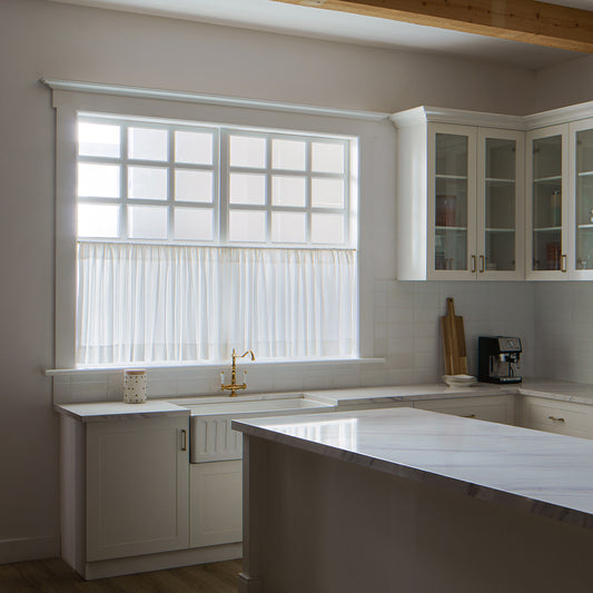
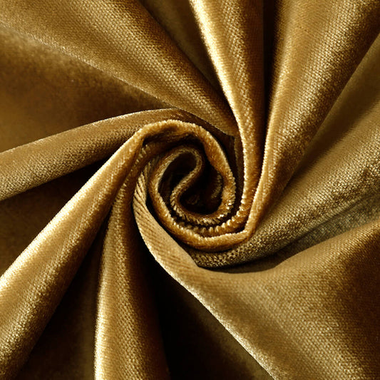
Fabric weaves and textures alter color intensity. VeilVeil’s velvet drapes absorb 40% more light than linen, deepening emerald or ruby hues. Linen’s natural slubs scatter light, softening color saturation for muted elegance.
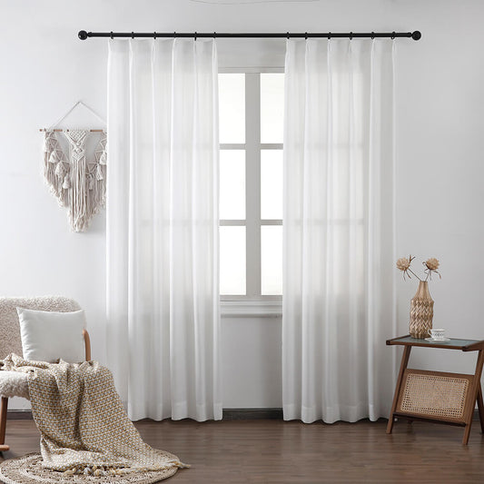
Heavy jacquard drapes in silver-gray add formal depth, while cotton-linen blends in cream keep spaces casual. Pro Tip: Glossy satins reflect light—avoid in east-facing rooms where sunrise glare amplifies. For example, VeilVeil’s flax linen in Misty White appears softer than polyester alternatives, reducing clinical starkness. Ever notice how velvet drapes look richer at night? That’s bidirectional pile catching artificial light.
VeilVeil Expert Insight
FAQs
No—aim for tonal harmony. VeilVeil’s swatch kits help coordinate drapes 2-3 shades darker or lighter than walls for layered sophistication without monotony.
Are patterned drapes suitable for small bedrooms?Yes, if scale-appropriate. VeilVeil’s 4” pinstripe drapes add verticality to low ceilings, while large florals overwhelm. Always contrast pattern size with existing textures.
Lena Linen Curtains
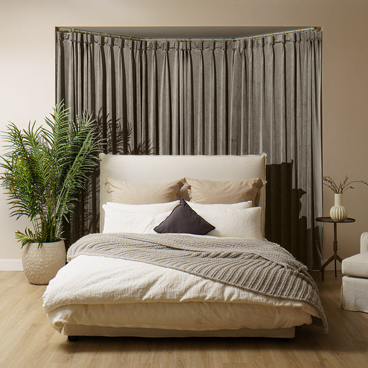
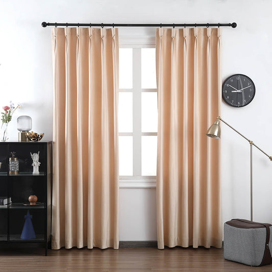
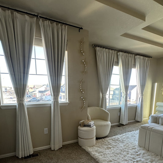
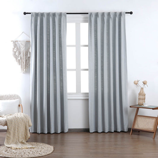
Image Gallery


