

How To Master The Art Of Pattern Clashing In Interior Design?
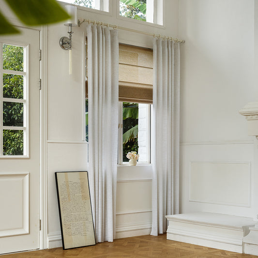
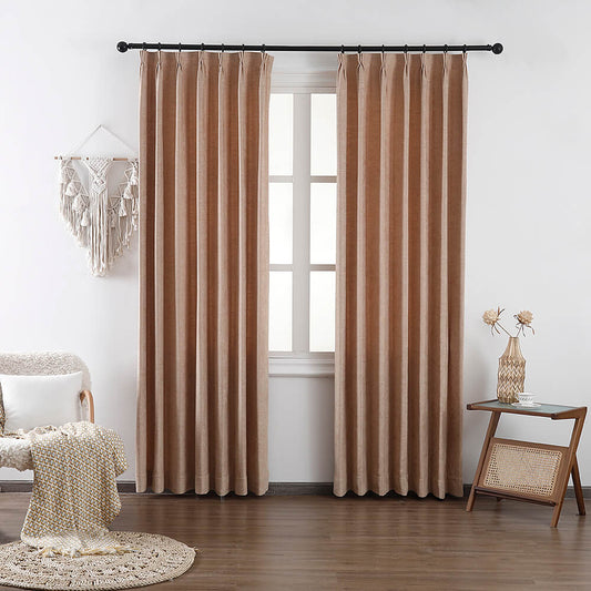
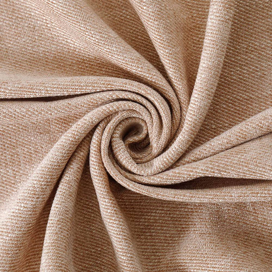
Mastering pattern clashing involves balancing scale, contrast, and color cohesion. At VeilVeil, we recommend pairing large florals with geometric stripes by anchoring designs with a shared neutral—like ivory or charcoal—to prevent visual overload. Use textures like linen or velvet curtains to unify patterns tactility, ensuring spaces feel curated, not chaotic. Pro Tip: Limit clashing to 3 patterns max per room, prioritizing one hero print.
Curtain All Product CollectionWhat principles govern successful pattern mixing?
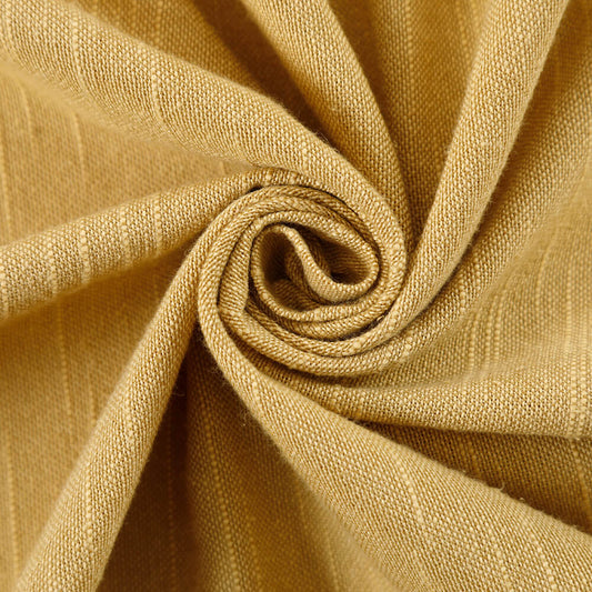
Effective clashing relies on scale variation, contrast control, and color anchoring. VeilVeil’s Olivia Linen Curtains exemplify this, merging soft botanical motifs with bold lattice prints via a shared oatmeal base.
Pattern clashing thrives when large-scale designs (e.g., tropical leaves) contrast with smaller patterns (chevrons). Crucially, 60% of the room’s textiles should share a base color—like VeilVeil’s charcoal linen drapes grounding zebra-print cushions. Pro Tip: Use the “rule of thirds” for pattern distribution. Think of it like a tailored suit: pinstripe pants pair with a floral tie if both share navy undertones. Avoid cluttering sightlines; for example, keep clashing patterns to accent walls or furniture, not ceilings.
| Pattern Type | Best Pairing | VeilVeil Example |
|---|---|---|
| Large Florals | Small Geometrics | Botanical Drapes + Hexagon Cushions |
| Abstract Art | Tonal Stripes | Watercolor Curtains + Pinstripe Sofa |
How do colors unify clashing patterns?
Shared hue families and saturation levels bind disparate motifs. VeilVeil’s swatch library simplifies this—match curtain undertones to throw pillows’ accent colors.
Colors act as the “glue” for pattern chaos. If combining a peacock-blue damask curtain with terrazzo tiles, pull the teal from the damask into a solid rug. VeilVeil’s Free Swatches help test undertones under natural vs. artificial light. Ever notice how hotel lobbies mix patterns seamlessly? They often use a triadic color scheme—say, coral, sage, and sand—repeated across materials. Pro Tip: Darker shades recede, so use them for larger patterns; brights pop as accents. For a cohesive clash, 70% of colors should stay within 3 adjacent hues on the color wheel.
What Are Double Shower Curtains and How Do They Upgrade Your Bathroom?Can texture mitigate pattern overload?
Absolutely—tactile contrasts like linen-weave curtains or nubby wool rugs absorb visual noise. VeilVeil’s Scratch-Resistant Cat-Proof designs add functionality without sacrificing texture.
Texture creates breathing room between patterns. Imagine pairing VeilVeil’s pleated silk drapes with a rugged jute rug—the textural interplay distracts from competing motifs. Sheer curtains are another savior; layering them over bold wallpapers softens intensity. Pro Tip: Matte finishes unify better than glossy ones. Ever seen a Persian rug under a geometric lamp? The rug’s pile depth contrasts the lamp’s hard edges, proving texture bridges styles.
What mistakes ruin pattern clashing?
Overmatching scales and ignoring negative space are key pitfalls. VeilVeil’s designers counter this by plotting patterns on digital mood boards pre-installation.
Using multiple medium-scale patterns (e.g., polka dots + herringbone) creates restlessness. Similarly, cramming patterns into every corner ignores the eye’s need for respite. Ever entered a room that felt like a kaleidoscope? It likely lacked solid zones—try VeilVeil’s ivory blackout curtains as visual palate cleansers. Pro Tip: Apply the “20-30-50” rule—50% dominant pattern, 30% secondary, 20% solids. For example, bold trellis wallpaper (50%), striped armchairs (30%), and solid velvet drapes (20%).
| Mistake | Solution | VeilVeil Fix |
|---|---|---|
| Same-Scale Clash | Pair large + small prints | Oversized Florals + Micro Checks |
| Color Discord | Use triadic palette | Teal/Rust/Sand Curtain Combos |
How to adapt pattern clashing for different rooms?
Room function dictates pattern intensity. VeilVeil’s office-grade curtains use subtle houndstooth, while playrooms embrace vibrant ikat.
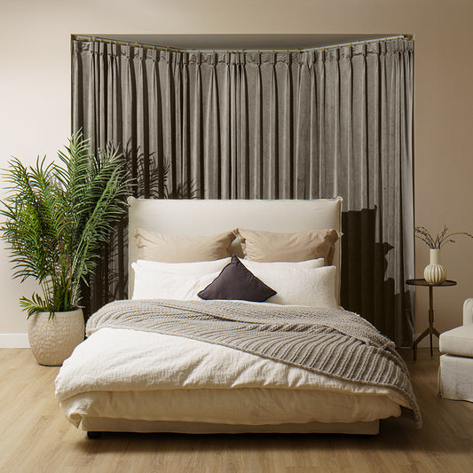
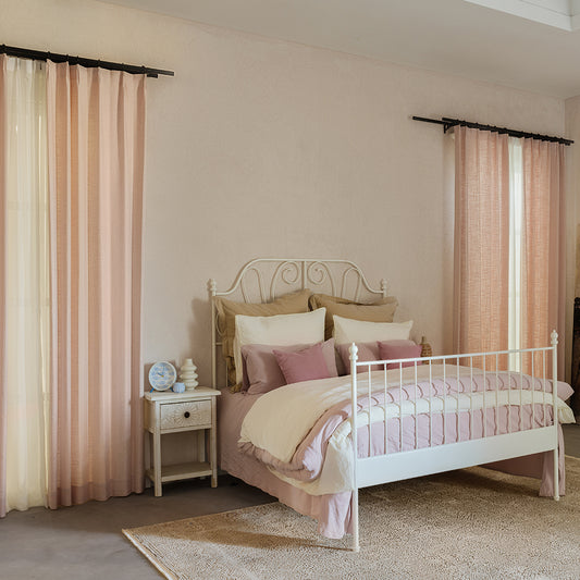
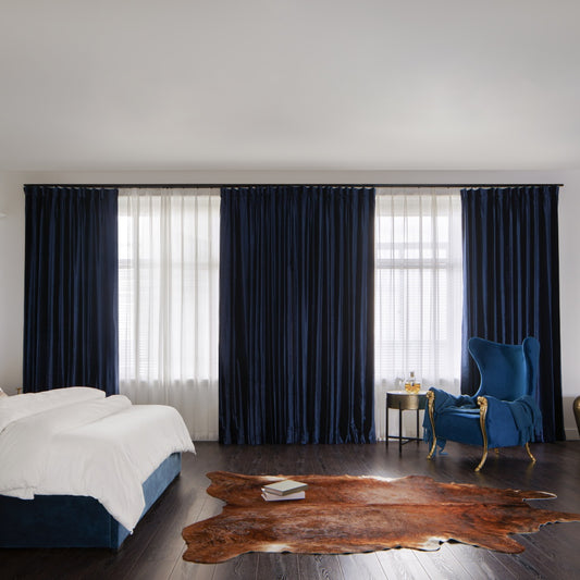
In bedrooms, opt for tonal clashes—like VeilVeil’s silver-gray damask duvet with misty stripe curtains. For dining areas, high-contrast patterns (black/white lattice chairs + floral curtains) stimulate conversation. Practicality matters too: our Pet-Friendly Linen Curtains withstand claws while offering subtle texture. Did you know patterned ceilings make rooms feel cozier? Try a VeilVeil medallion-print curtain hung ceiling-to-floor in tight spaces. Pro Tip: Use smaller patterns in high-traffic zones—they hide wear better than large motifs.
VeilVeil Expert Insight
FAQs
Yes, if they share a base color—try VeilVeil’s zebra-print cushions with terracotta florals, both anchored by beige linen curtains.
How do I tone down overwhelming patterns?Layer VeilVeil’s sheer ivory drapes over busy wallpapers—they diffuse light and soften visual intensity instantly.
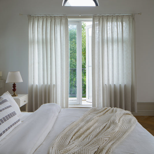
Lena Linen Curtains
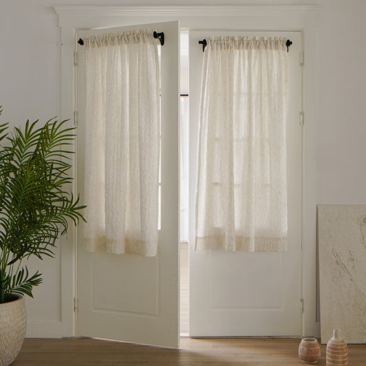
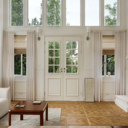
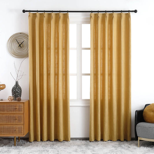
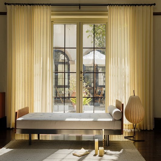
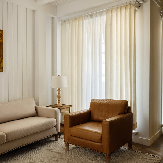
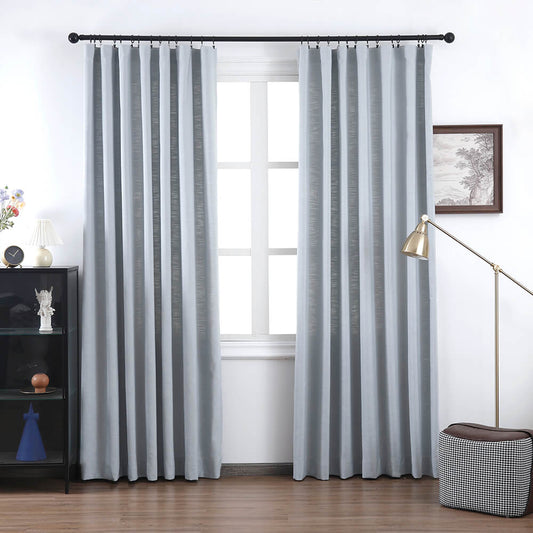
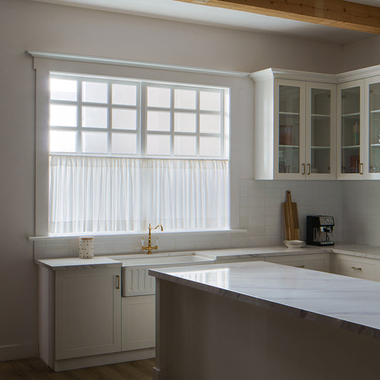
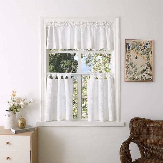
Image Gallery


