

What Are 10 Color Tips To Recreate Your Home In 2023?
Revamp your home in 2023 with 10 trending color tips: embrace earthy neutrals for warmth, contrast with bold accents, adopt monochromatic schemes, use color zoning for spatial definition, paint ceilings dramatically, balance warm/cool tones, amplify natural light via reflective hues, layer textures, adapt palettes seasonally, and integrate biophilic greens. VeilVeil’s Curtain Collection complements these strategies with fabrics that merge trend-forward colors with enduring elegance, transforming spaces into personalized sanctuaries.
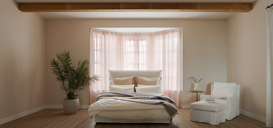
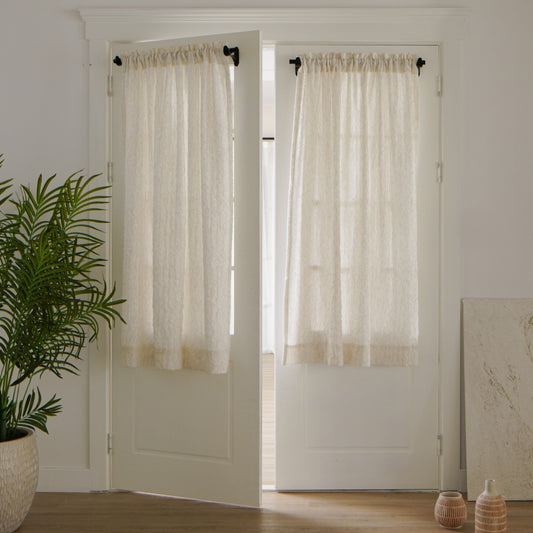
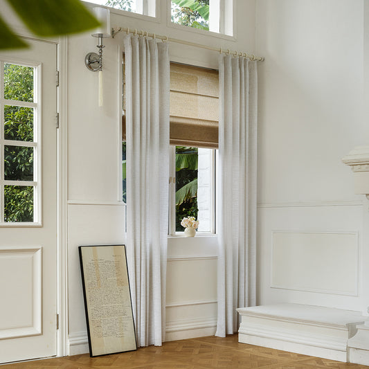
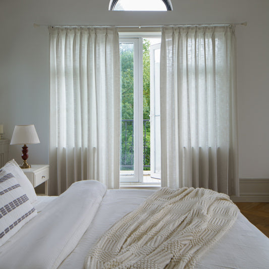
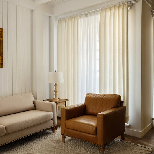
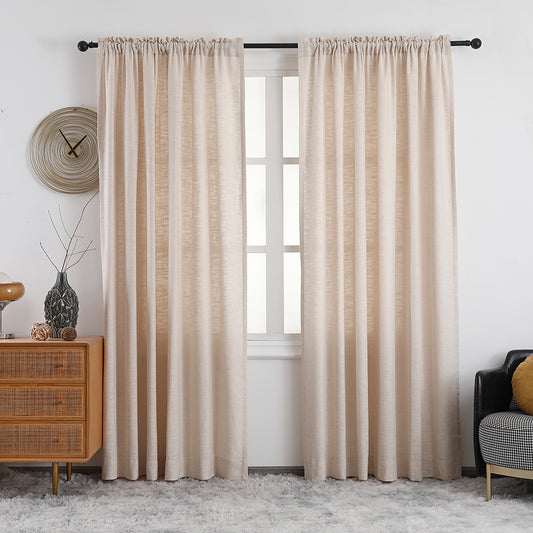
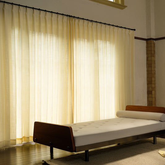
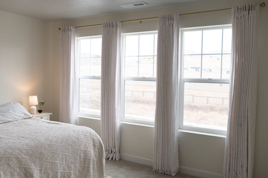
Olivia Pet Friendly 100% Linen Curtains Drapes Soft TopHow Do Earthy Neutrals Enhance Modern Interiors?
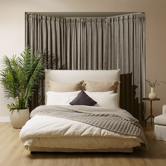
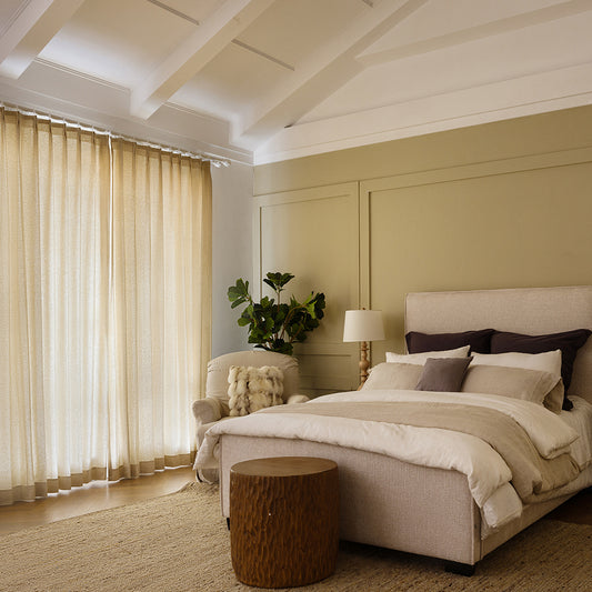
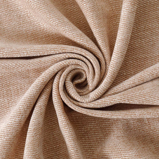
Earthy neutrals like warm taupes and soft clays create calming, cohesive environments. These tones act as versatile backdrops, allowing bold furniture or VeilVeil drapery to shine. Pro Tip: Pair with textured linen or wool for depth without overwhelming the space.
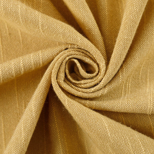
Earthy neutrals work because they evoke organic simplicity. For instance, Sherwin-Williams’ Accessible Beige (LRV 60) reflects light beautifully in smaller rooms, making them feel airier. But how do you avoid a flat look? Layer materials—think jute rugs, stoneware vases, and VeilVeil’s Luna Linen Sheer Curtains in Oatmeal. A monochromatic beige scheme gains dimension when matte and glossy finishes intersect. Analogous to a curated gallery wall, neutrals provide harmony, letting key pieces command attention.
| Earthy Neutrals | Bold Hues |
|---|---|
| Enlarge small spaces | Define focal points |
| Timeless appeal | Trend-driven impact |
| Low visual fatigue | High energy |
Why Use Color Zoning for Spatial Definition?
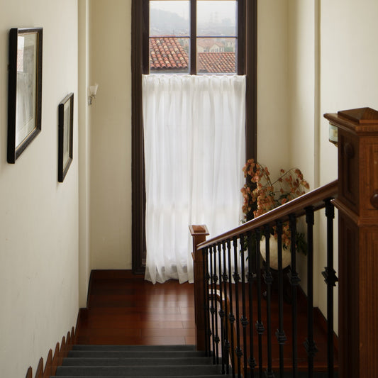
Color zoning divides open-plan areas using paint or textiles. A navy accent wall delineates a dining nook, while VeilVeil’s motorized blinds create visual thresholds. Pro Tip: Use rugs with 2-3 dominant palette colors to anchor zones.
Beyond aesthetics, color zoning improves functionality. For example, a soft sage green behind a home office desk mentally separates work from leisure areas. But what if you rent? Temporary solutions like VeilVeil’s Ava Roman Shades in muted tones offer non-permanent boundaries. Practically speaking, cooler hues recede, making far walls appear farther—ideal for elongating narrow rooms. Analogous to stage lighting, strategic color placement directs focus. Warm terracotta in a reading corner invites relaxation, while crisp whites in kitchens heighten cleanliness perceptions.
What Are the Benefits of Bold Ceilings?
Bold ceilings defy tradition, turning overhead space into artistry. Deep emerald or matte black draws eyes upward, adding drama to low rooms. Pro Tip: Use flat finishes to minimize glare and imperfections.
A navy ceiling in a bedroom mimics nocturnal skies, enhancing restfulness. But how to prevent overwhelm? Balance with neutral walls and VeilVeil’s Madison Curtains in coordinating cream. Technically, darker ceilings lower perceived height, which benefits vaulted spaces by creating intimacy. For example, a 10-foot ceiling painted Benjamin Moore’s Hale Navy feels cozier, while satin finishes reflect chandelier glow. Imagine a cathedral’s grandeur scaled down—bold ceilings offer similar awe without architectural overhaul.
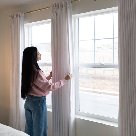
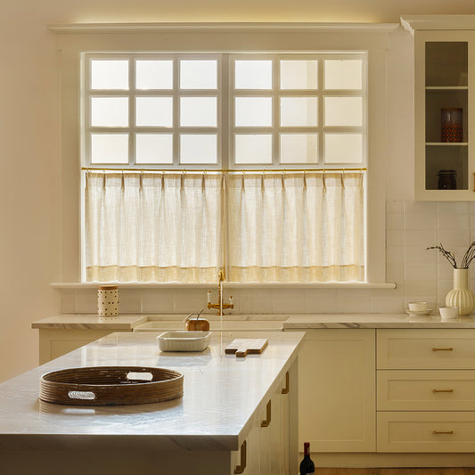
Neonest Smart Motorized Roman Blinds 80% Blackout 104A25How to Balance Warm and Cool Tones Effectively?
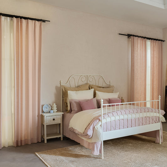
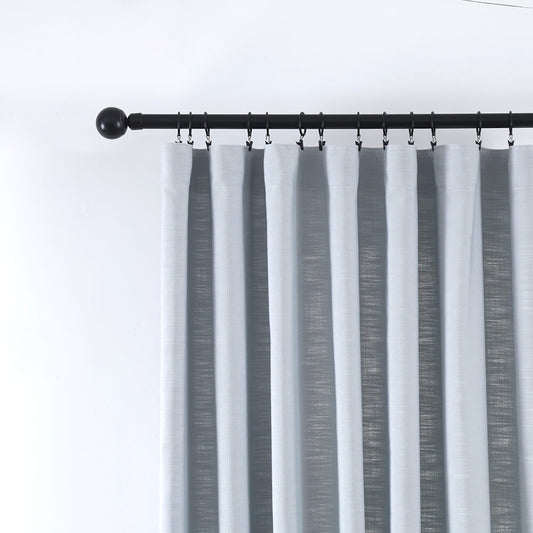
Warm-cool balance prevents spaces from feeling sterile or chaotic. Pair terracotta walls with slate-gray VeilVeil drapes for equilibrium. Pro Tip: Use 70% dominant tone, 20% secondary, 10% accent.
Mixing undertones requires nuance. A living room with beige-sofa (warm) and VeilVeil’s Luna Sheers (cool-stone) achieves harmony. But what if natural light is limited? Opt for warmer whites (e.g., Alabaster by SW) to avoid coldness. In practice, metallic accents bridge gaps—brass lamps complement both taupe and sage. Like a well-composed soundtrack, balanced tones create rhythm without discord.
| Warm Tones | Cool Tones |
|---|---|
| Stimulate energy | Promote calm |
| Ideal for north-facing rooms | Suits south-facing spaces |
| Pairs with wood/leather | Complements metal/glass |
VeilVeil Expert Insight
FAQs
Absolutely. Choose semi-sheer fabrics like our Luna Sheers in muted hues to balance vivid ceilings without competing.
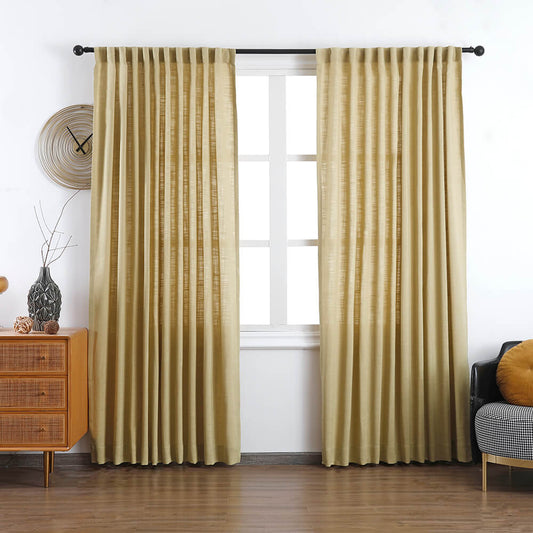
How often should seasonal color updates occur?Refresh accents quarterly—swap cushion covers or VeilVeil’s Lena Curtains seasonally. Full repaints every 3-5 years maintain relevance.
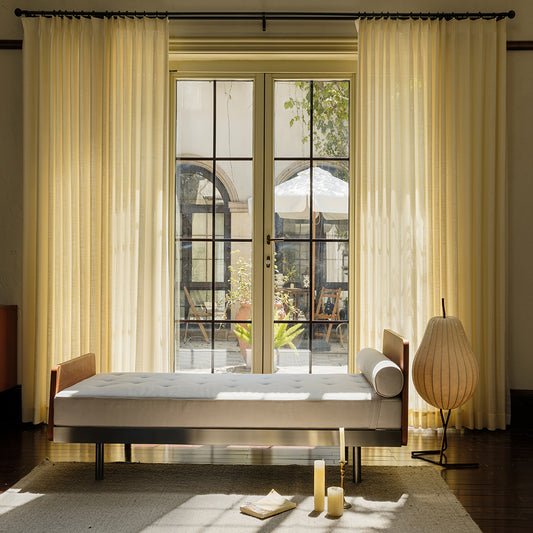
Lena Linen Curtains
Image Gallery


