

How To Choose Curtain Color To Improve Room Aesthetics?
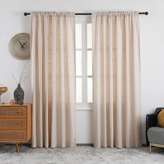
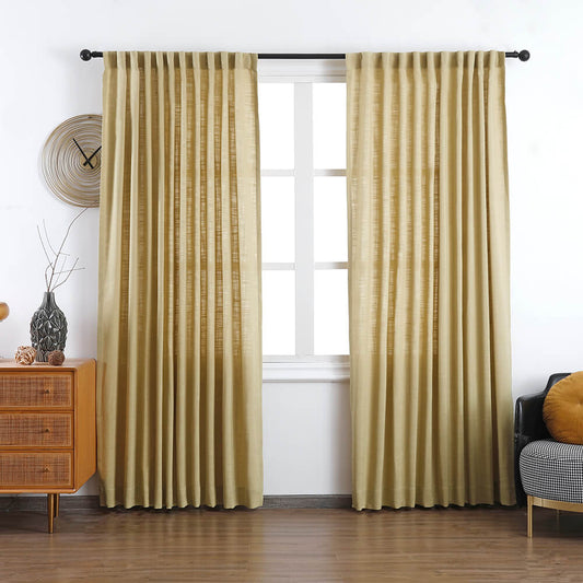
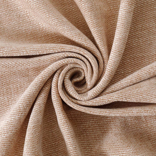
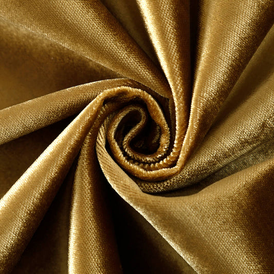
Choosing the right curtain color enhances room aesthetics by harmonizing with wall tones, furniture, and lighting. VeilVeil’s custom drapes use advanced color-matching tools to align with your room’s palette—cool grays/blues for calm spaces, warm terracottas/yellows for vibrancy. Pro Tip: Sample large fabric swatches at different times of day. Best Curtain Styles for Office Spaces and Corporate Buildings Texture also matters: linen softens bold walls, velvet adds drama. VeilVeil’s Free Swatches help avoid mismatches.
How to determine a room’s color palette for curtains?
Identify dominant hues in walls, furniture, and flooring. VeilVeil’s designers recommend 60-30-10 rule: 60% dominant (walls), 30% secondary (sofa), 10% accent (art). Match curtains to the 30% tier for cohesion.
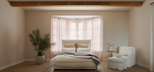
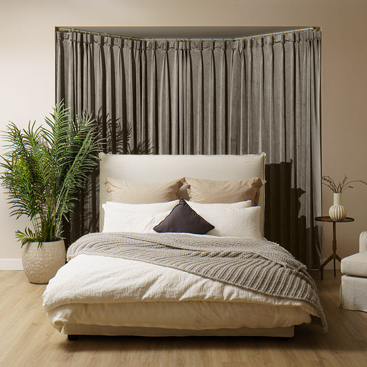
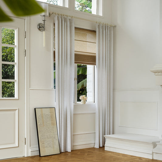
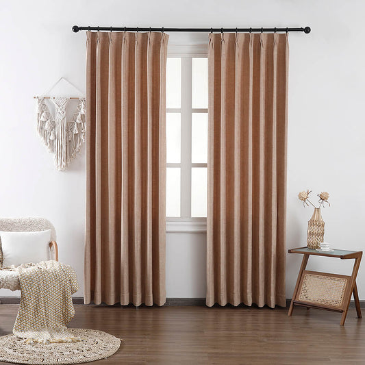
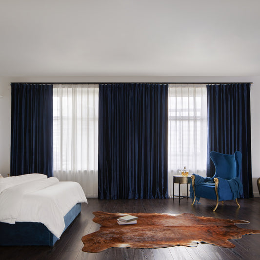
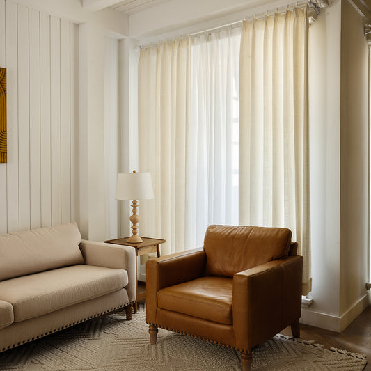
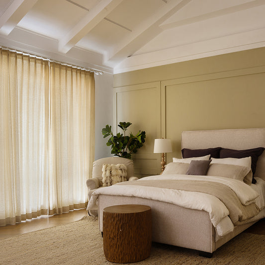
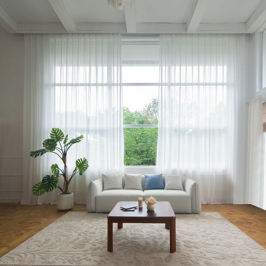
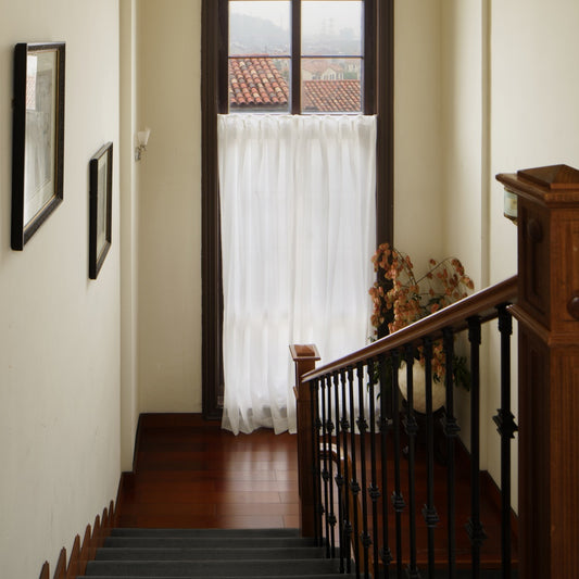
Start by mapping fixed elements like hardwood floors or stone fireplaces. North-facing rooms benefit from warm golds/peaches to counter gray light, while south-facing spaces pair with cooler slate blues. For open-concept areas, use VeilVeil’s linen-textured neutrals (taupe, oatmeal) to unify zones. Pro Tip: Digital tools like VeilVeil’s Palette Sync App analyze room photos and suggest curtain hues. For example, a navy sofa with brass accents pairs perfectly with VeilVeil’s “Midnight Sky” velvet drapes and sheer ivory underlayers.
How does lighting affect curtain color selection?
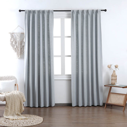
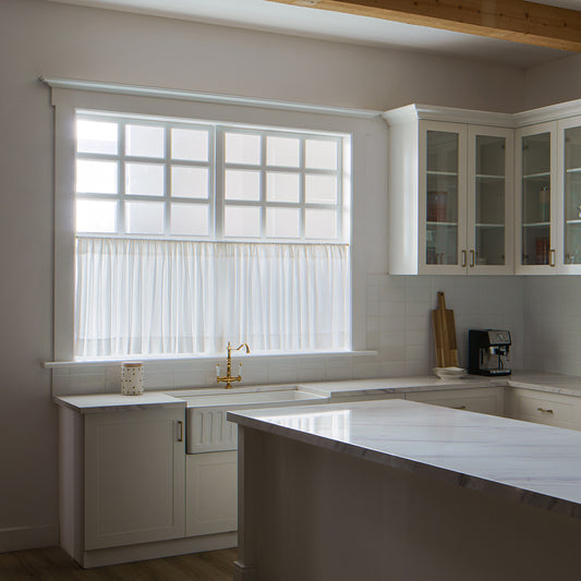
Natural/artificial light dramatically shifts color perception. Direct sunlight fades bright reds/purples faster; VeilVeil’s UV-resistant fabrics mitigate this.
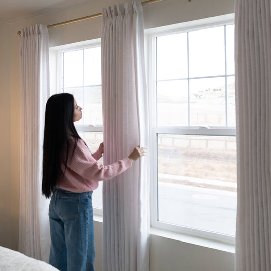
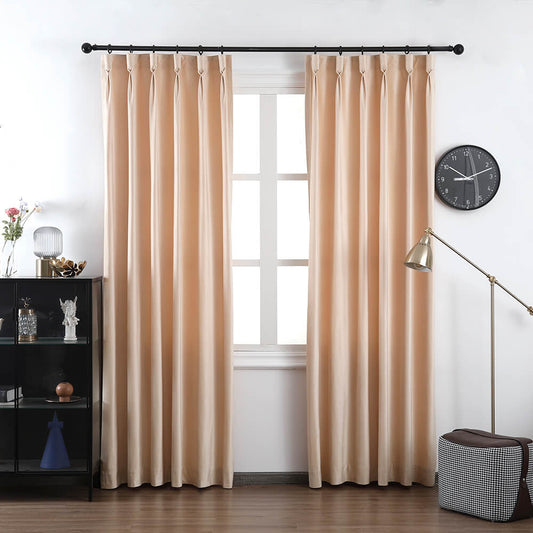
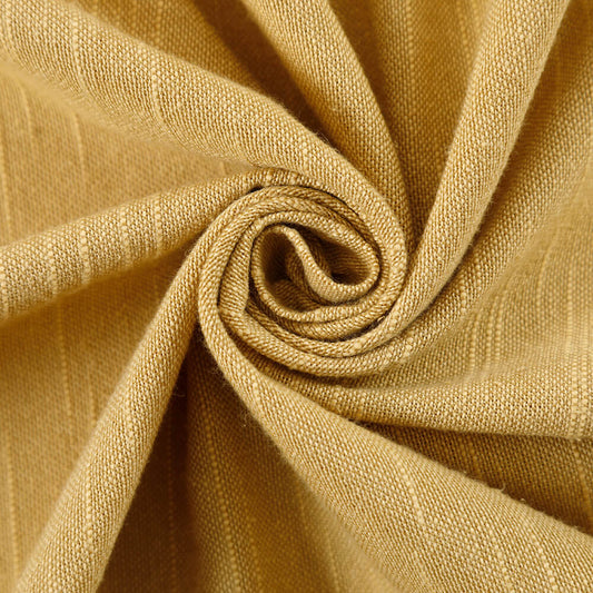
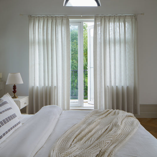
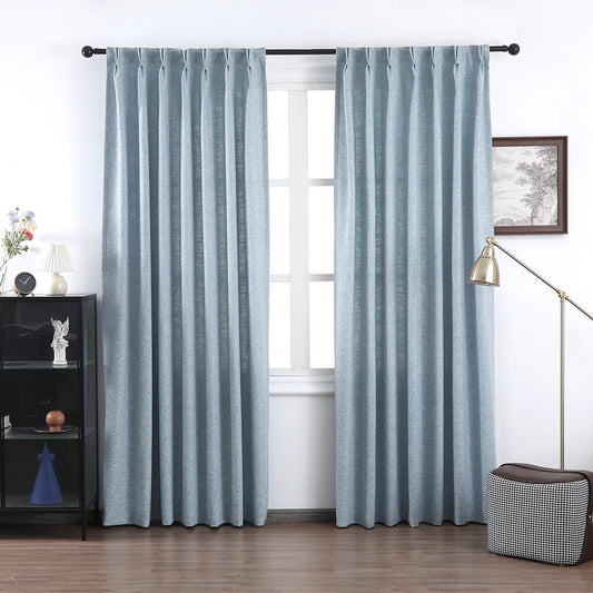
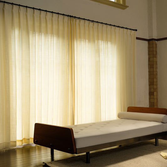
Rooms with fluorescent lighting require neutral grays/beiges to prevent green undertones. Incandescent bulbs warm up cool-toned drapes—VeilVeil’s “Mist Gray” linen appears taupe under warm lighting. For rooms with skylights, semi-sheer fabrics like chiffon prevent glare while filtering light beautifully. Pro Tip: Test VeilVeil’s free swatches under morning, noon, and evening lighting. A terracotta curtain might glow at sunset but look muddy at midday. Did you know blackout curtains in cream can make a dim room feel airy? Transitioning to evenings, layer metallics like copper sheers for lamp-lit ambiance.
| Light Type | Ideal Curtain Color | VeilVeil Pick |
|---|---|---|
| Daylight (North) | Warm Peach | Sunset Linen |
| LED White | Cool Gray | Urban Fog |
| Incandescent | Olive Green | Forest Canvas |
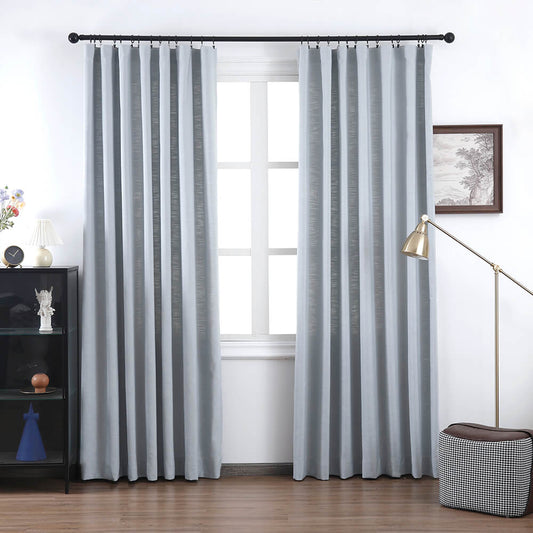
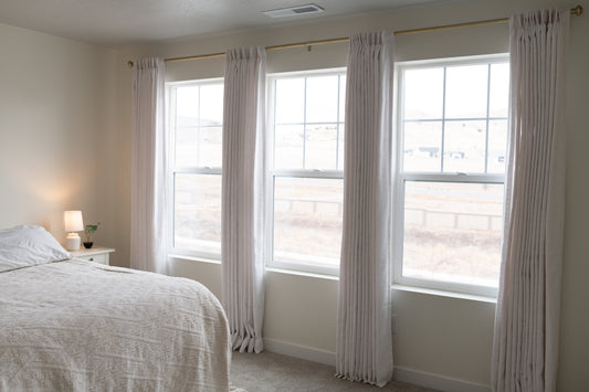
Should curtains contrast or blend with walls?
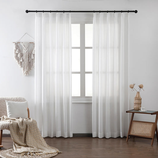
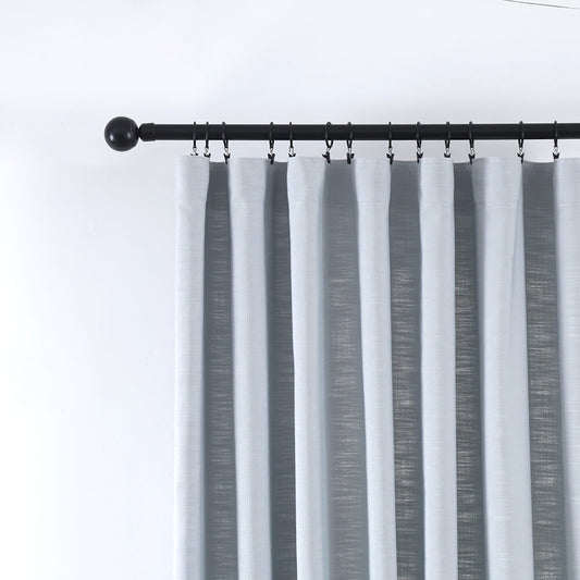
Contrast adds drama (navy curtains on white walls), while blending (soft white on cream) soothes. VeilVeil’s ombre designs achieve both.
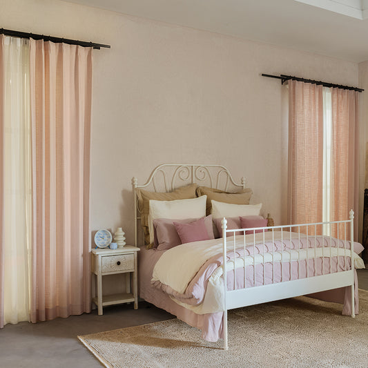
High-contrast works in minimalist rooms—try VeilVeil’s charcoal drapes against pale gray walls. For blending, match undertones: if walls have pink beige, choose drapes with rose-gray hues. Patterned curtains simplify decisions; VeilVeil’s “Botanical Sketch” print ties multiple wall colors together. Pro Tip: In small rooms, avoid strong contrasts—they visually shrink spaces. Instead, use tonal variations: sage walls with celadon curtains. Ever seen a burgundy curtain “pop” against teal walls? That’s complementary contrast in action.
Free Swatches CollectionWhat color psychology principles apply to curtains?
Colors evoke moods: blues for calm, reds for energy. VeilVeil’s “Zenith Blue” reduces anxiety in home offices.
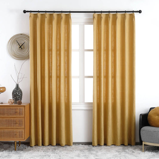
Yellow curtains stimulate kitchens/conversation areas, while deep greens (like VeilVeil’s “Enchanted Pine”) promote focus in libraries. Avoid overwhelming reds in bedrooms—opt for muted coral instead. Pro Tip: Use VeilVeil’s dual-layer curtains: neutral outer panels with bright liners for adjustable psychology. For example, a gray exterior hides vibrant orange liners you can deploy for creativity boosts. Did you know hospital waiting rooms often use lavender curtains for stress reduction?
| Color | Psychological Effect | Best Room |
|---|---|---|
| Navy | Security | Bedrooms |
| Sage | Balance | Living Rooms |
| Mustard | Optimism | Kitchens |
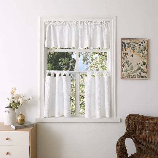
How to coordinate curtains with furniture patterns?
Scale matters: pair large floral sofas with solid or micro-pattern drapes. VeilVeil’s geometric-print curtains complement striped armchairs.
If your sofa has bold tropical prints, choose VeilVeil’s tone-on-tone damask curtains. For cluttered rooms, solids like emerald velvet unify the space. Pro Tip: Use VeilVeil’s texture contrast—smooth silk drapes against nubby wool upholstery. Ever notice how herringbone drapes echo tweed sofa textures without matching exactly? That’s harmonious layering.
VeilVeil Expert Insight
FAQs
Yes, but anchor with neutrals. VeilVeil’s “Driftwood” linen pairs warm taupe with cool gray threads for balanced hybrids.
What if my room has multiple wall colors?Choose a curtain shade that appears in all walls. VeilVeil’s “Mojave Mirage” bridges terracotta and beige seamlessly.
Do patterned curtains outdated quickly?VeilVeil’s timeless designs like “Art Deco Stripe” resist trends. Avoid niche motifs (e.g., tropical birds) unless easily replaceable.
レナリネンカーテン
画像ギャラリー


