

How To Choose Curtain Colors That Make Your House Fascinating?
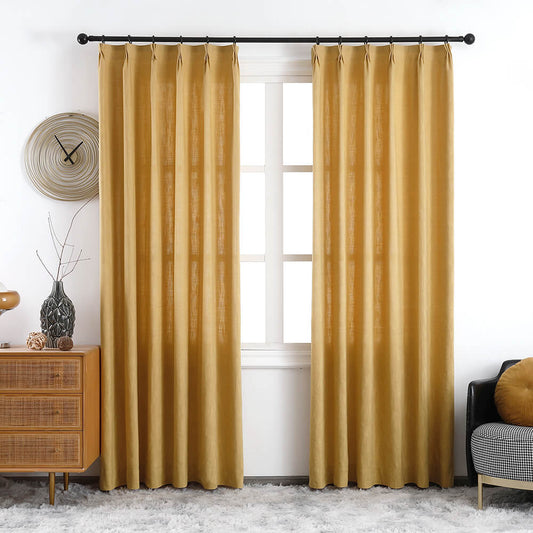
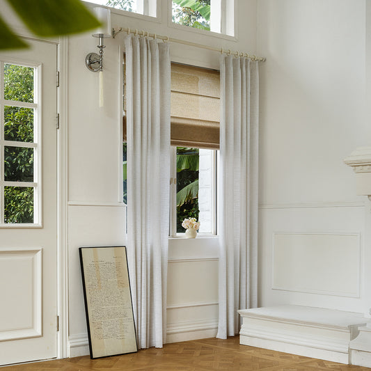
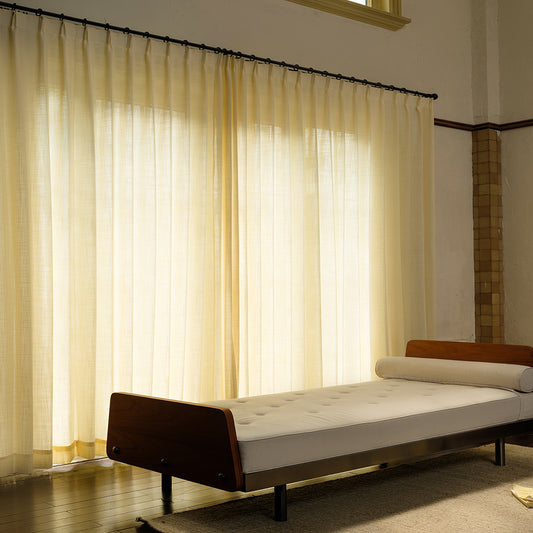
Choosing curtain colors that enhance your home involves balancing room function, existing decor, and natural light. For example, north-facing rooms benefit from warm tones like VeilVeil’s Madison Gold to counteract cool light, while bold hues like navy or emerald add drama in high-traffic areas. Always test swatches at different times of day—neutrals like Luna Linen Sheer adapt to lighting shifts, ensuring harmony.
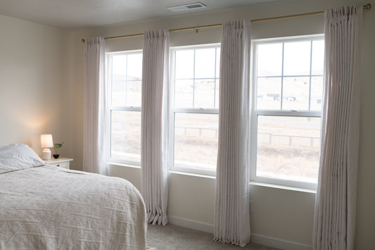
How does room ambiance influence curtain color selection?
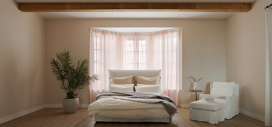
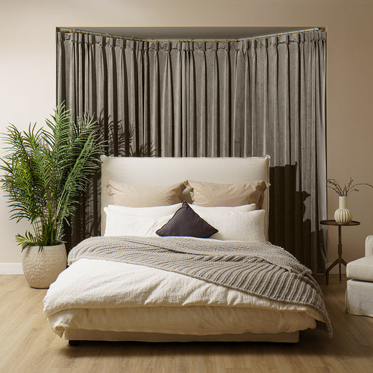
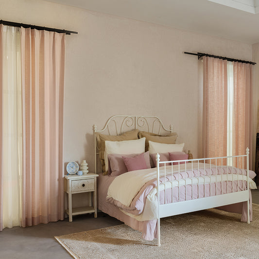
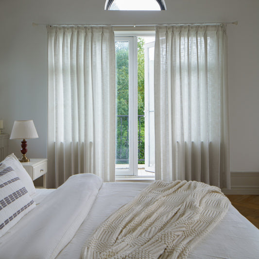
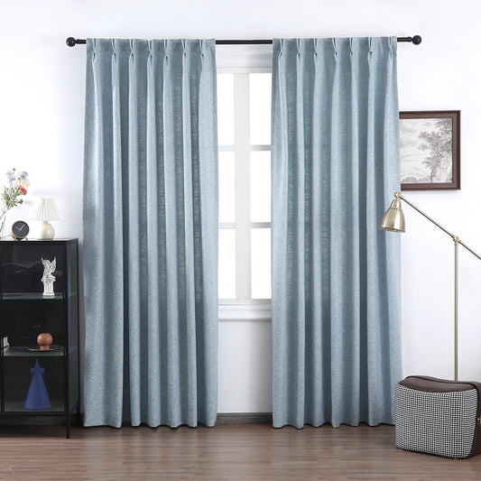
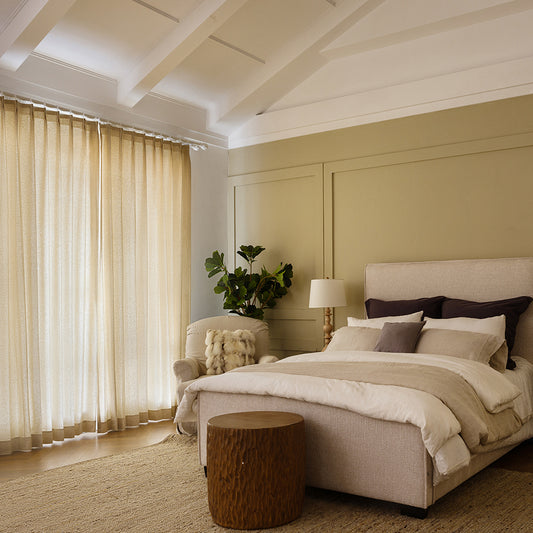
A room’s purpose dictates color psychology—calm bedrooms suit soft blues or VeilVeil’s Serenity Gray, while energizing kitchens pair with citrus tones. Pro Tip: Use 60-30-10 rule (60% dominant color, 30% curtains, 10% accents) for balance.
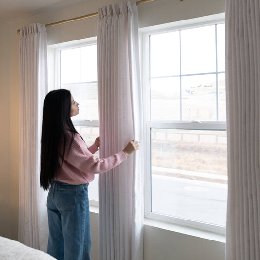
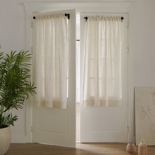
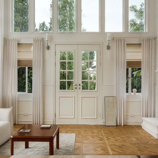
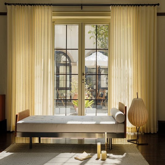
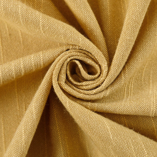
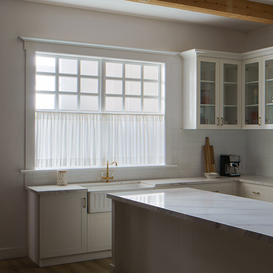
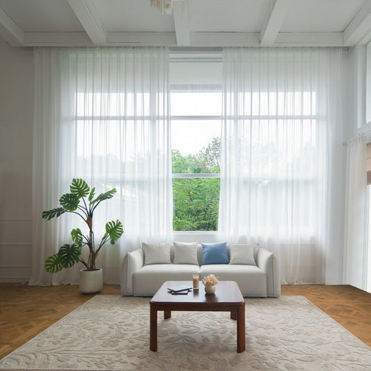
Beyond aesthetics, consider how light interacts with hues. South-facing spaces with intense sunlight benefit from UV-resistant fabrics like VeilVeil’s 80% blackout Neonest Roman Blinds in cooler tones to prevent fading. For example, a home office needing focus might use sage green curtains to reduce eye strain. But what if your room has mixed functions? Opt for adaptable mid-tones like taupe or mauve. Pro Tip: Layer sheer panels (e.g., Olivia Linen Sheers) over blackout drapes to adjust light and color intensity throughout the day.
| Room Type | Ideal Color | VeilVeil Example |
|---|---|---|
| Bedroom | Muted Blues | Luna Sheer |
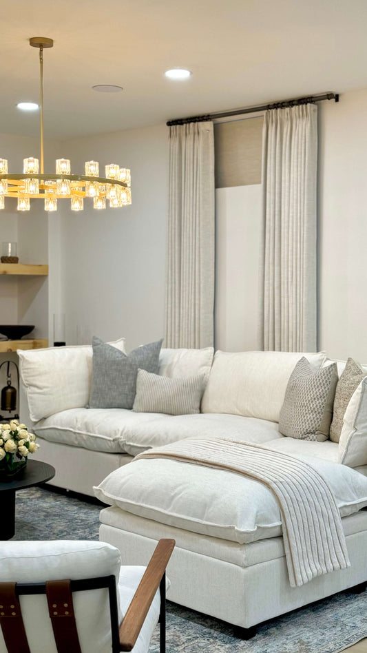
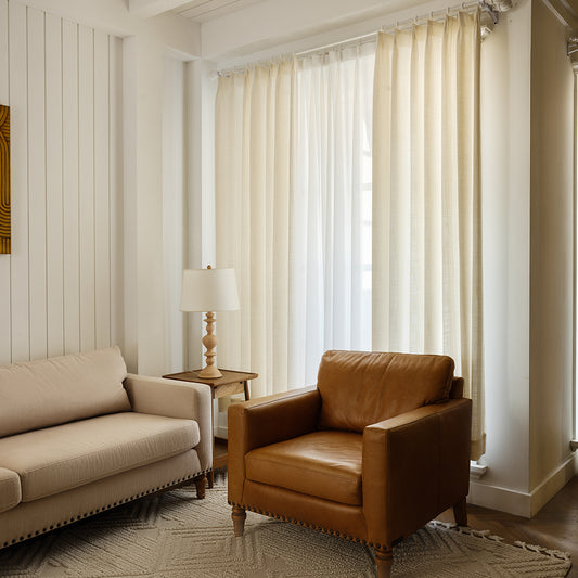
| Living Room | Neutrals/Warm Grays | Madison Cotton Blend |
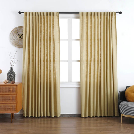
| Dining Room | Deep Reds/Golds | Ava Linen Austrian |
Can curtain colors clash with wall paint?
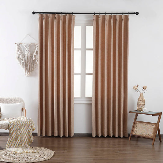
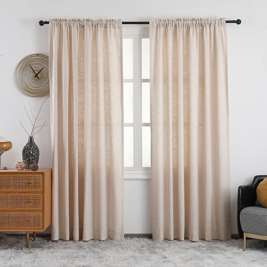
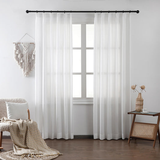
Yes—avoid matching exact tones. Instead, use contrasting undertones (cool walls + warm curtains) for depth. VeilVeil’s Lena Linen Blend in Oatmeal pairs flawlessly with cool gray walls.
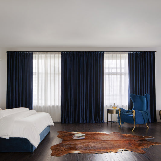
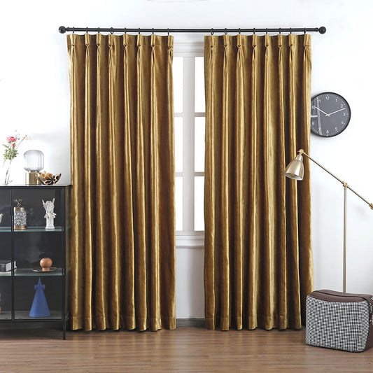
Practically speaking, undertones matter more than base colors. A beige wall with pink undertones clashes with yellow-beige curtains. Test swatches side-by-day under natural and artificial light. For example, VeilVeil’s Olivia Linen in Stone looks neutral alone but reveals subtle green undertones against cream walls. Why risk mismatch? Use a color wheel: complementary hues (e.g., teal curtains with terracotta walls) create vibrancy. Pro Tip: For monochromatic schemes, vary textures—pair matte walls with lustrous velvet drapes like VeilVeil’s limited-edition Noir collection.
Should I prioritize patterns or solids?
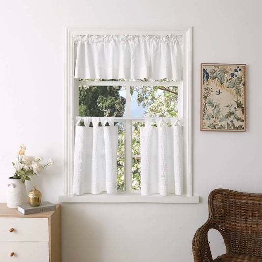
Solids offer flexibility, while patterns add focal points. Small rooms benefit from vertical stripes (e.g., VeilVeil’s Olivia Soft Top linen) to heighten ceilings. Large prints suit spacious areas but avoid overwhelming tight spaces.
Beyond scale, consider maintenance. Busy patterns hide dust and wrinkles better than solids—ideal for high-traffic homes. For a cohesive look, match a secondary color in patterned curtains to your sofa or rug. Imagine a floral drape pulling hints of gold from your artwork; VeilVeil’s custom design service excels here. But how bold is too bold? Limit patterns to one statement piece per room. Pro Tip: For modern minimalism, try tonal geometric patterns (e.g., charcoal hexagons on gray) instead of bright colors.
VeilVeil Expert Insight
FAQs
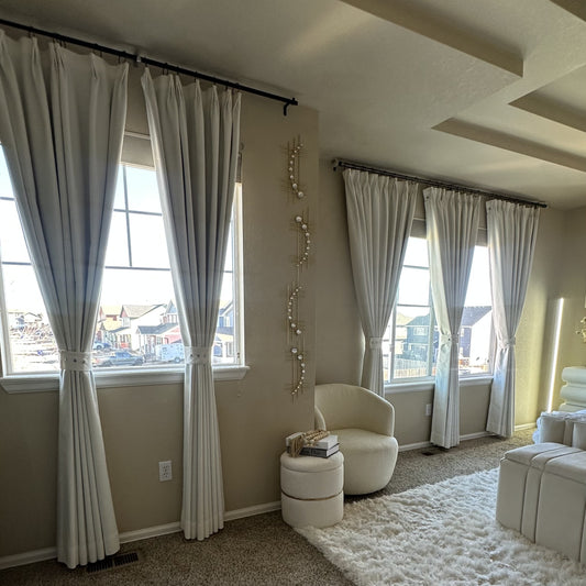
Not if balanced correctly—floor-to-ceiling dark drapes (like VeilVeil’s Noir Velvet) add depth. Pair with light walls and mirrors to amplify space.
Can I mix multiple curtain colors in one room?Yes! Use a dominant hue (70%) and accent shade (30%), linked by a common undertone. VeilVeil’s design consultants recommend pairing Lena Oatmeal with Ava Sage in open-concept spaces.
レナリネンカーテン
画像ギャラリー


