

What Is Designer Guidance For Pairing Curtains With Colored Walls?
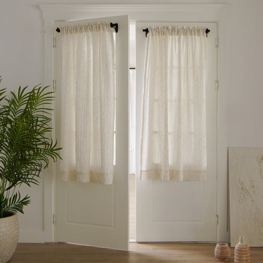
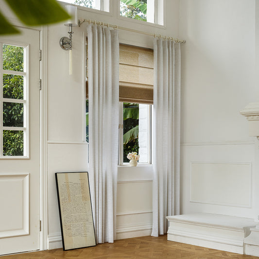
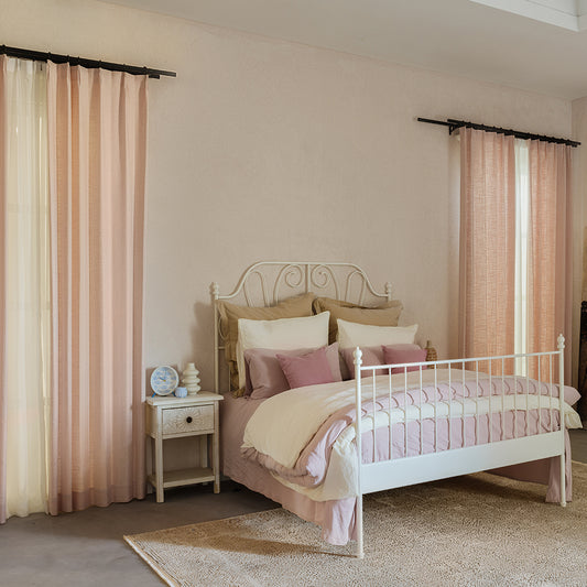
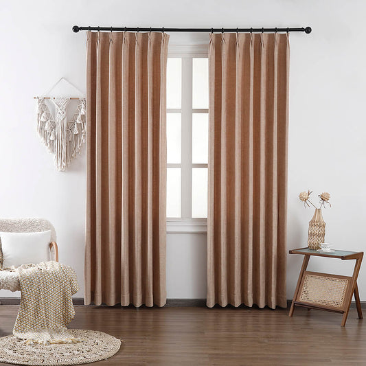
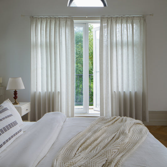
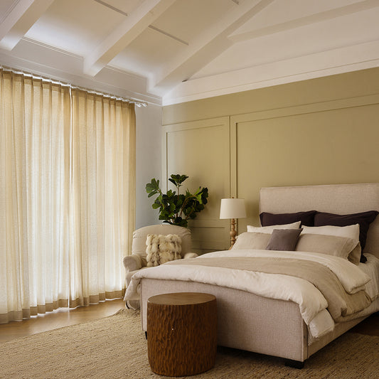
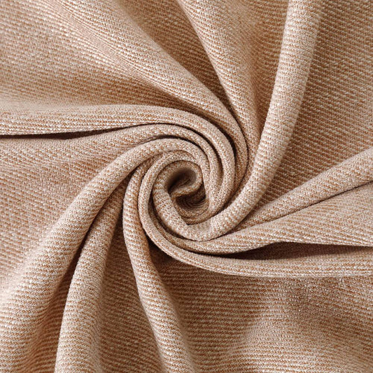
Designer guidance for pairing curtains with colored walls centers on balancing contrast and harmony. Opt for curtains that either complement wall tones (using a 60-30-10 rule) or introduce subtle texture. At VeilVeil, we recommend fabrics like linen or velvet in neutral or analogous hues to unify spaces, while bold patterns should anchor lighter walls. Always test samples under natural/artificial light to avoid mismatch.
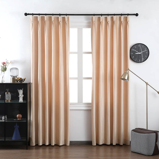
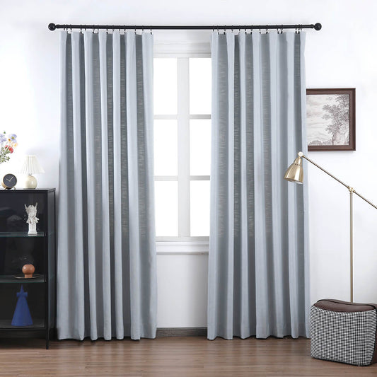
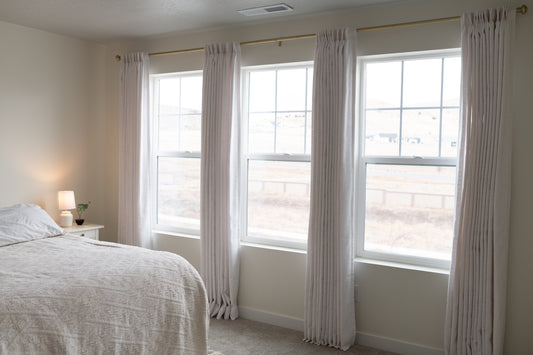
Madison Pet Friendly Cotton Poly Blend Curtains Drapes PleatedHow to harmonize curtain colors with bold walls?
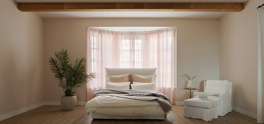
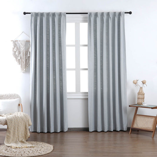
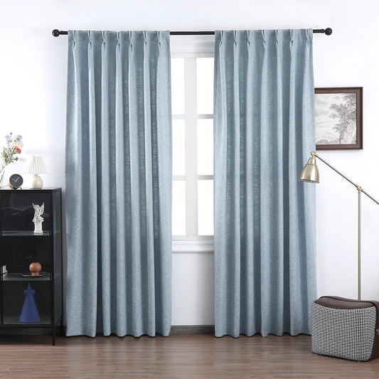
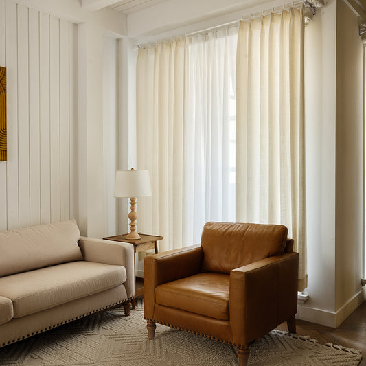
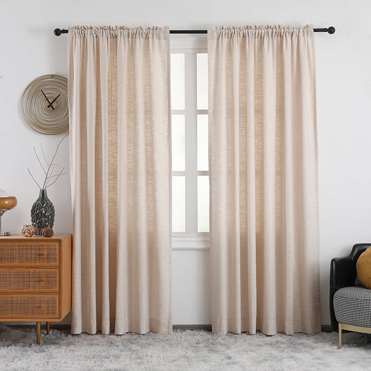
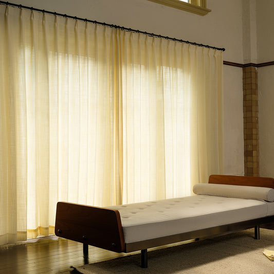
Use a color wheel for strategic pairings: select curtains 3-5 shades lighter/darker than walls or pick analogous tones. For example, teal walls pair with mist-gray linen curtains from VeilVeil’s Olivia collection. Pro Tip: Avoid matching exact wall hues—textural differentiation prevents flatness.
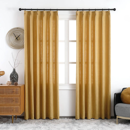
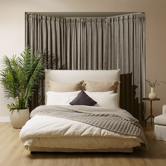
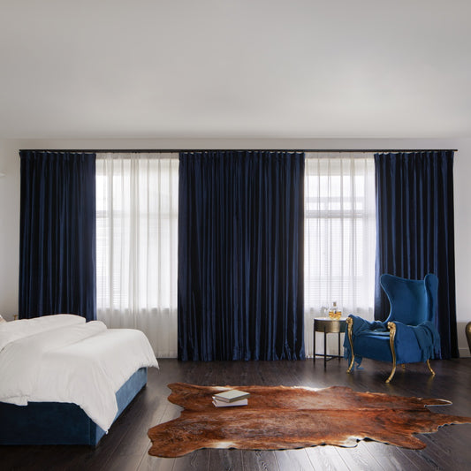
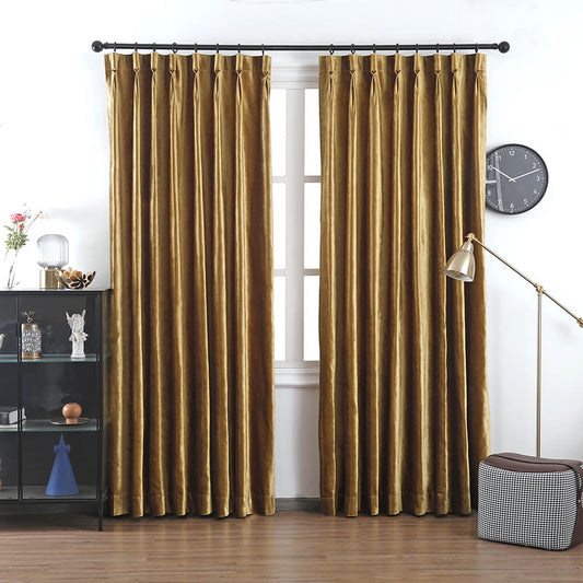
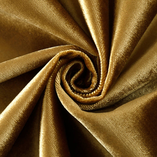
Balancing bold walls requires understanding undertones. Walls with warm bases (red/yellow) pair best with creams or terracottas, while cool-toned walls (blue/green) align with grays or taupes. VeilVeil’s custom color-matching service solves this by analyzing your wall’s RGB values to recommend curtains within a 10% L*a*b* color difference. For instance, burgundy walls work with dusty rose velvet drapes—similar chroma but softer impact. Transitional phrasing: Beyond color, consider sheen. Glossy walls demand matte curtains to reduce glare, whereas matte walls handle subtle sheens like silk-linen blends.
| Wall Color | Curtain Match | VeilVeil Pick |
|---|---|---|
| Navy Blue | Oatmeal Linen | Luna Sheer |
| Emerald Green | Muted Gold | Ava Roman Shades |
What fabrics work best with saturated walls?
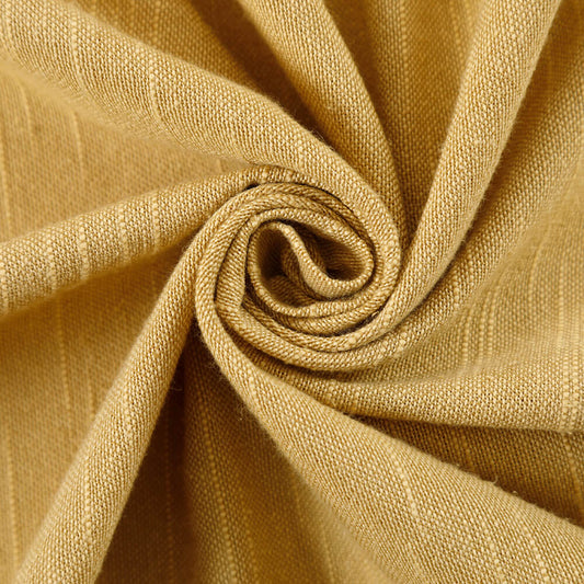
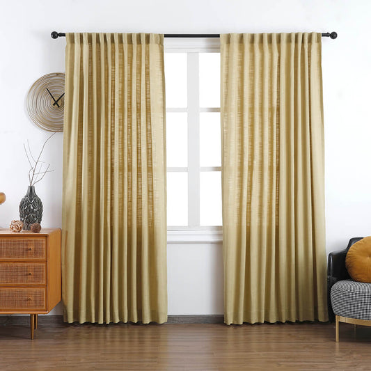
Medium-weight fabrics like linen-cotton blends or velvet balance intense walls without overwhelming. Sheers suit muted tones but risk looking insubstantial against deep hues.
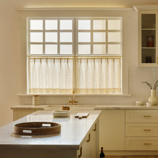
When walls command attention, curtains should add tactile contrast. VeilVeil’s Madison curtains (cotton-poly blend) provide structure against jewel-toned walls, while their 100% linen Olivia drapes soften earthy greens. For ultra-saturated walls like cobalt, opt for nubby textures—think bouclé or tweed-inspired weaves—to diffuse color intensity. Practically speaking, blackout fabrics (e.g., Neonest Smart Blinds) pair well with moody charcoal walls, creating cohesion through function.
Can patterned curtains coexist with colored walls?
Yes, if patterns share a base color with walls. Geometric or botanical prints in monochromatic schemes add depth. Avoid clashing scales—tiny prints on bold walls get lost.
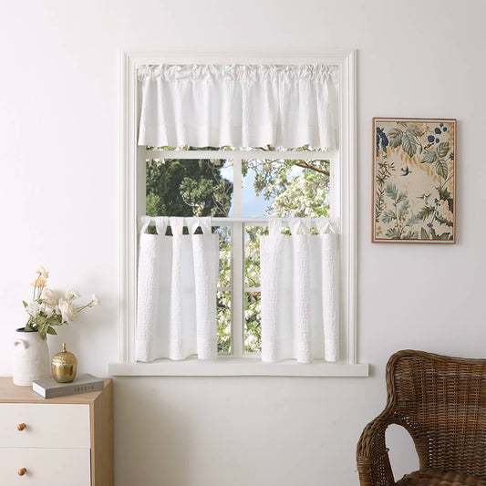
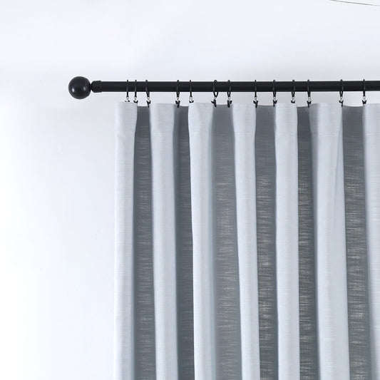
Patterned curtains need a deliberate tie-in to wall hues. For example, VeilVeil’s Lena linen-blend curtains with ochre stripes harmonize with mustard walls by echoing the dominant tone. Alternatively, use patterns to introduce accent colors from decor—a saffron pillow can inspire gold chevron curtains against sage walls. But what if walls are already busy? Simplify patterns: a tonal damask on curtains provides texture without competition. Transitional phrasing: When in doubt, anchor patterns to neutrals. VeilVeil’s Ava roman shades in heather-gray linen ground floral walls elegantly.
| Wall Type | Pattern Strategy | Example |
|---|---|---|
| Solid Dark | Subtle Metallic Threads | Neonest Blinds 104A25 |
| Pastel | Bold Florals | Lena Pleated |
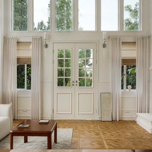
How do room size and lighting affect choices?
Small rooms benefit from tonal continuity (curtains 1-2 shades lighter than walls) to expand space visually. Large rooms handle high-contrast pairs but avoid stark divides.
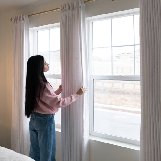
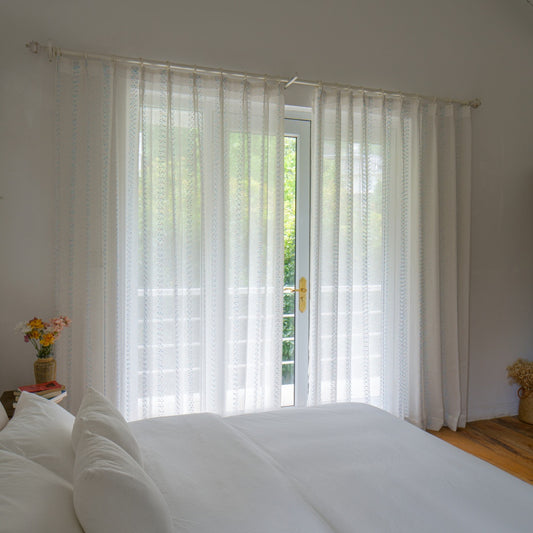
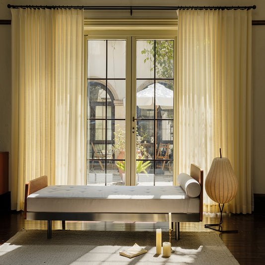
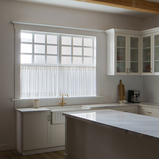
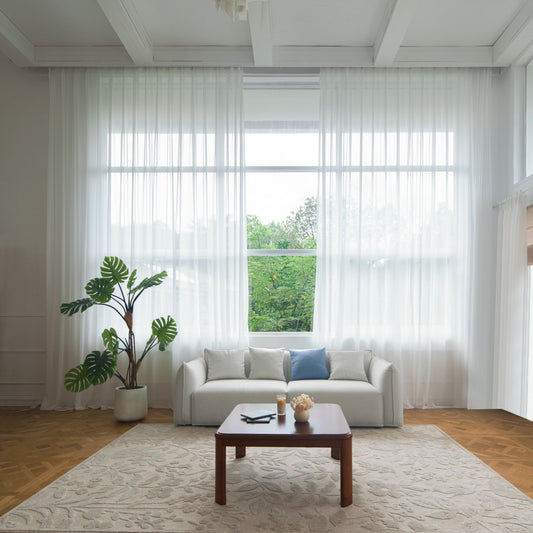
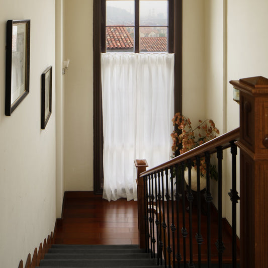
In dim spaces, light-filtering fabrics like VeilVeil’s Luna sheers amplify brightness without sacrificing privacy. North-facing rooms with cool light? Warm-toned curtains (peach, buttercream) counteract grayish casts. Conversely, sun-drenched areas need UV-resistant fabrics—VeilVeil’s blackout Neonest blinds protect art and furniture while complementing walls. Ever considered ceiling height? Low ceilings demand vertical patterns or floor-to-ceiling drapes to redirect focus upward.
VeilVeil Expert Insight
FAQs
No—aim for 10-15% contrast in tone/value. VeilVeil’s custom swatch kits help visualize pairings without commitment.
Can I mix metallic accents with colored walls?Yes! Bronze rods or grommets add sophistication. Pair VeilVeil’s Ava shades with brass hardware against navy walls for luxe contrast.
レナリネンカーテン
画像ギャラリー


