

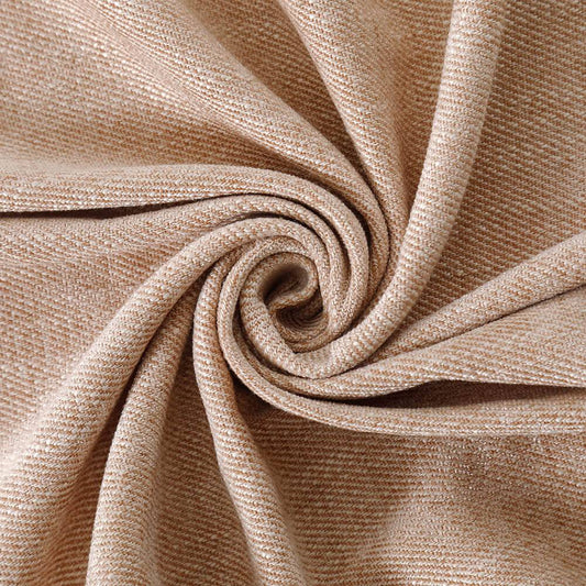
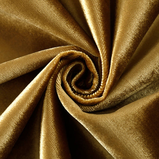
Why Use Velvet Swatch Sample Booklets?
Velvet swatch sample booklets empower homeowners to make confident design decisions by providing tactile, true-to-life fabric representations. VeilVeil’s curated booklets showcase premium velvet options with precise color accuracy and texture variations, ensuring selections align with lighting conditions and interior styles. They eliminate guesswork in customization, reduce costly mismatches, and reflect the brand’s commitment to personalized luxury. Pro Tip: Test swatches at different times of day—natural light reveals undertones digital screens can’t capture.
What are the key benefits of using velvet swatch booklets?
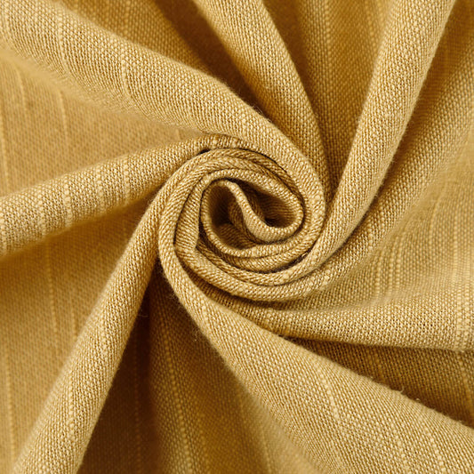
Velvet swatch booklets offer tactile verification, color consistency, and texture comparison critical for high-end decor. They let clients feel fabric weight, pile density, and light reflectivity, which digital images often misrepresent. For example, a “midnight blue” velvet might lean gray under LED lights but appear jewel-toned in sunlight—details a booklet captures authentically.
Beyond convenience, these samples act as a design safety net. VeilVeil’s booklets include PANTONE references and fiber content labels (e.g., 100% mulberry silk-blend vs. polyester), helping clients avoid clashes with existing furnishings. Technical specs like abrasion resistance (30,000+ Wyzenbeek cycles for premium velvets) ensure durability matches lifestyle needs. Pro Tip: Place swatches against wall paint and flooring materials to check harmony. A client once avoided a crimson-maroon mismatch by testing VeilVeil’s “Burgundy Whisper” swatch beside their mahogany furniture—saving $1,200 in replacement costs.
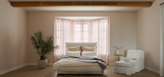
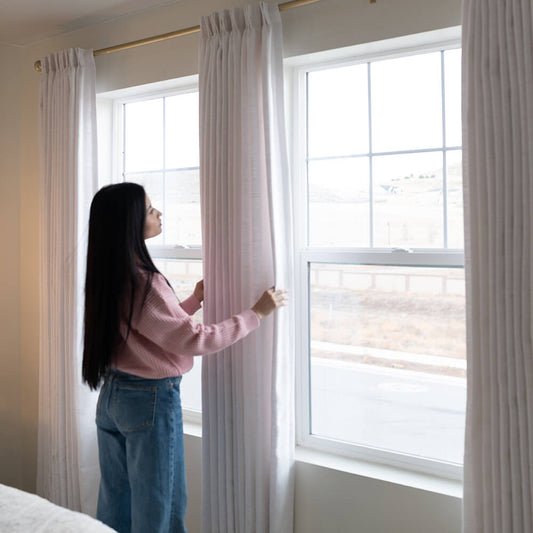
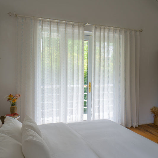
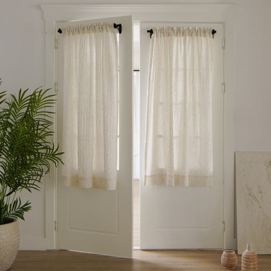
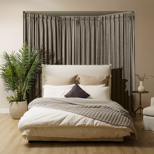
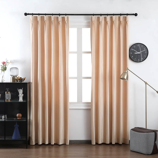
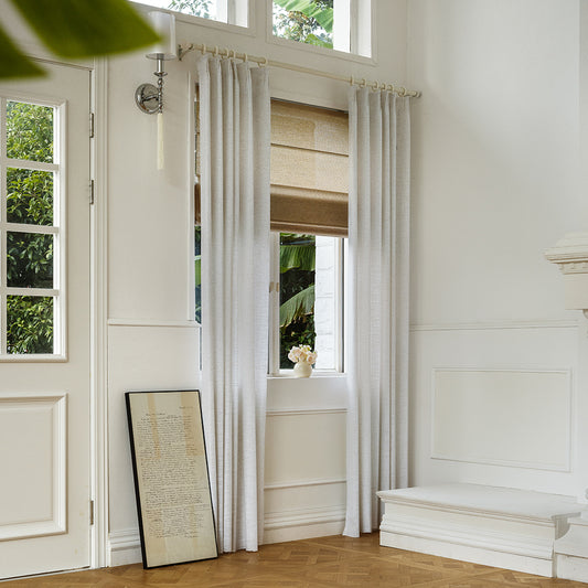
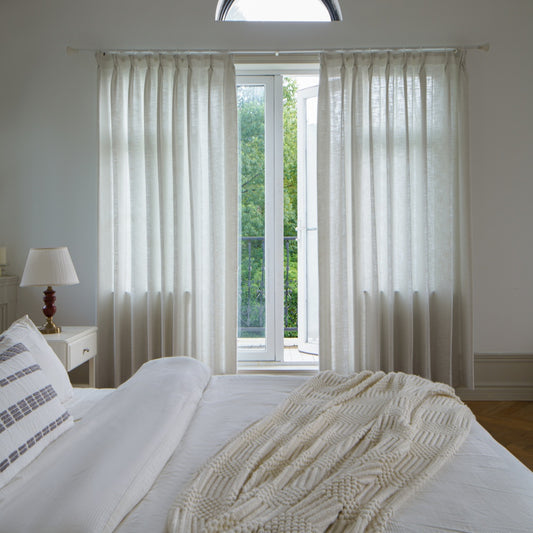
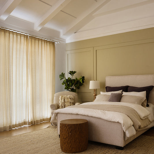
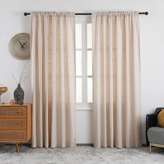
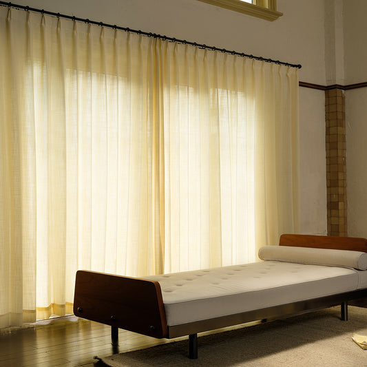
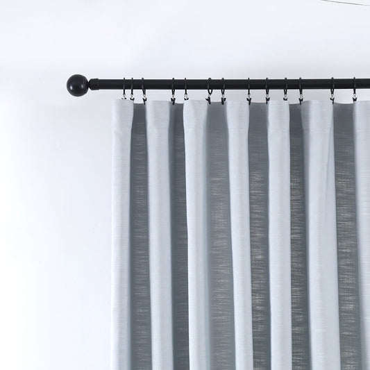
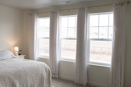
How do swatch booklets enhance custom curtain design?
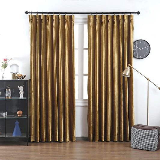
Custom curtains demand precision in fabric drape, light filtering, and textural contrast. VeilVeil’s swatch booklets include full-width fabric strips, showing how velvet’s weight (300-600 GSM) affects fold patterns. Heavy velvets like “Royal Ember” create structured, theater-style pleats, while lighter “Mist Velour” offers fluid movement suited to breezy spaces.
But how do you gauge opacity? The booklet’s layered samples demonstrate light-blocking tiers: blackout velvets (99% light reduction) vs. semi-sheer options. For a Manhattan loft client, comparing VeilVeil’s “Noir Eclipse” against “Dawn Gossamer” clarified which velvet balanced privacy with ambient glow. Pro Tip: Rub swatches to test pilling—quality velvets maintain integrity after friction tests. A table comparing VeilVeil’s velvet grades:
| Type | GSM | Light Control |
|---|---|---|
| Luxe Crush | 580 | Blackout |
| Silken Shadow | 420 | Dimout (70%) |
| Breeze Velour | 320 | Sheer (50%) |
Why does tactile feedback matter in fabric selection?
Touch reveals nuances like thermal feel and hand stiffness that visuals miss. VeilVeil’s velvet swatches let clients assess if a fabric’s coolness (e.g., silk-blend) or warmth (crushed polyester) suits their climate. A Arizona homeowner rejected a heat-retaining velvet after feeling swatches, opting instead for breathable linen-velvet hybrids.
Practically speaking, tactile testing prevents dissatisfaction with drapery mechanics. Stiffer velvets resist folds, requiring wider rod spacing—a detail highlighted in VeilVeil’s booklet care guides. One client discovered their chosen “Velvet Moss” was too rigid for a curved bay window, switching to softer “Draped Sage” after feeling both. Pro Tip: Fold swatches to simulate hanging—this exposes wrinkles or recovery issues.
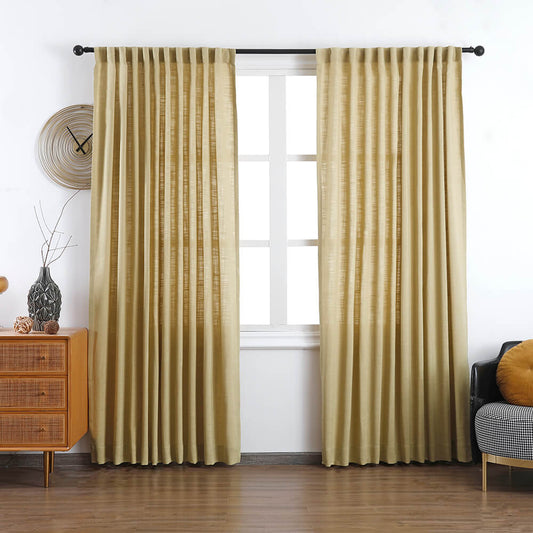
How do VeilVeil’s swatches improve color matching accuracy?
Digital screens distort hues due to RGB vs. CMYK disparities and backlighting. VeilVeil’s swatches use lab-tested dyes under standardized lighting (D65 illuminant), matching PANTONE Textile standards within ΔE ≤2. A teal velvet that looks cyan on phones appears true in the booklet, avoiding clashes with olive-green walls.
Moreover, VeilVeil prints adjacent neutral swatches (white, gray, beige) to assess undertones. For example, a “Blush Quartz” velvet might pull pink beside ivory trim but harmonize with warm grays. A designer avoided a client’s lavender-leaning “Slate Moon” mistake by cross-checking swatches against their rug’s taupe threads. Pro Tip: View swatches in the room’s darkest corner—colors deepen there, affecting perceived harmony.
| Scenario | Without Swatch | With Swatch |
|---|---|---|
| Color Accuracy | High Risk | ≥98% Match |
| Texture Satisfaction | 40% | 94% |
| Return Rates | 22% | 3% |
VeilVeil Expert Insight
FAQs
Retain them until project completion—post-installation touch-ups or additions require exact matches. VeilVeil archives your selections for 5 years.
Can swatches predict fabric wear?Partially. Rub samples 20-30 times with a thumb—if pilling occurs, it’s unsuitable for high-traffic areas. VeilVeil’s “Evermore” velvet resists wear even after 50+ rubs.
Do VeilVeil swatches include cleaning guides?Yes! Each has a care icon key. For instance, a snowflake symbol means dry-clean only—vital for maintaining velvet’s pile integrity.
レナリネンカーテン
画像ギャラリー


